ASYLUM VENTURES
ABOUT
Personal project for Asylum Ventures, a new venture firm dedicated to the creative act of building companies.
ROLE
Graphic Designer
GOAL
Personal project for Asylum Ventures, a new venture firm dedicated to the creative act of building companies.
DELIVERABLES
Brand Identity
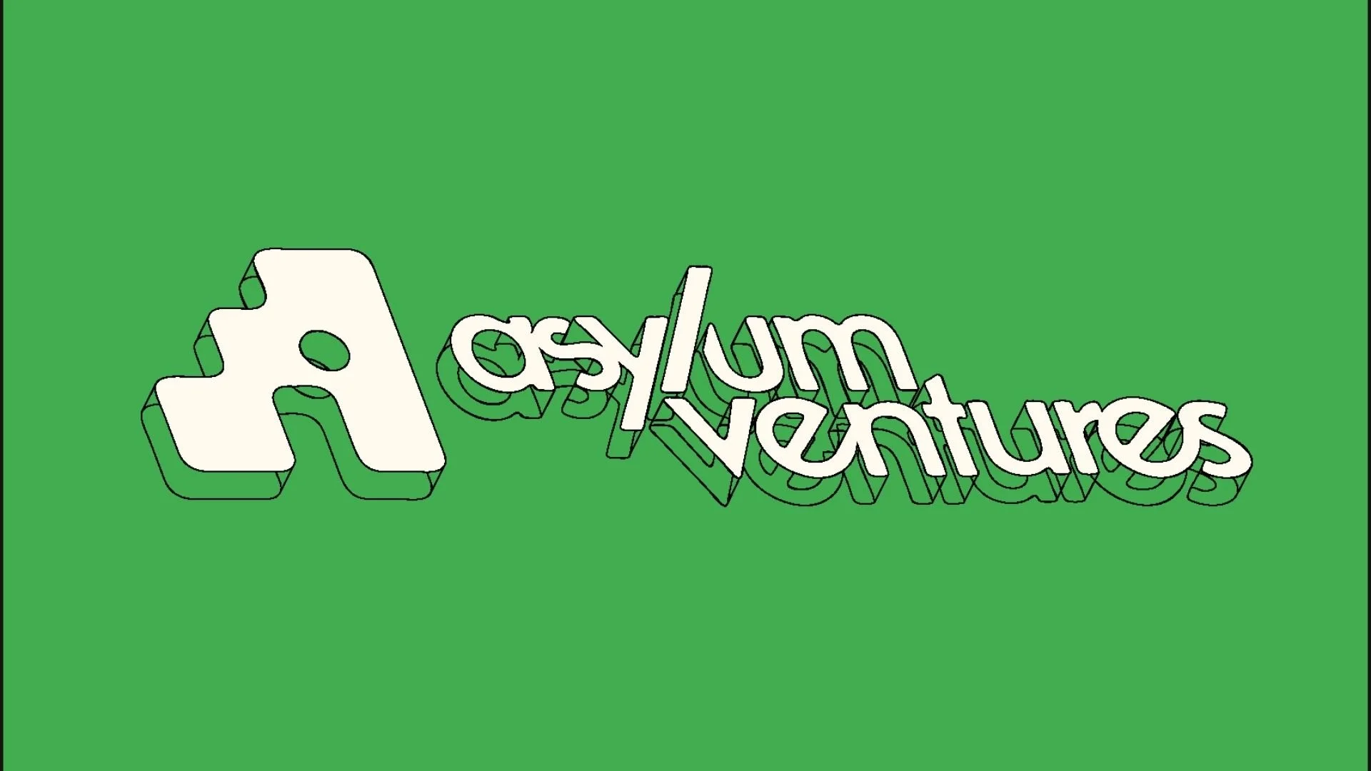
Wordmark/Lockup
Icon
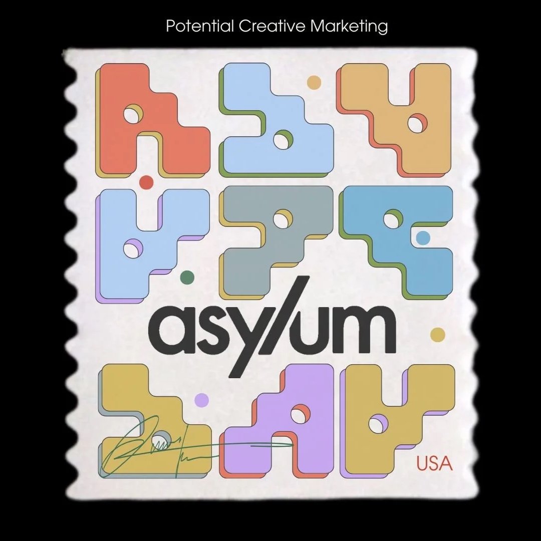
Potential marketing graphics
Website Hero Page
WHO IS ASYLUM VENTURES?The "anti-institution" institution.
Asylum Ventures believes that founders at the earliest stages don't want to work with firms that treat their companies like an asset class. They want partners who are human, firms with soul and point of view. The brief: build a brand that could look like an artist made it, and mean it.
How the work evolved.
Icon & Typeface Exploration
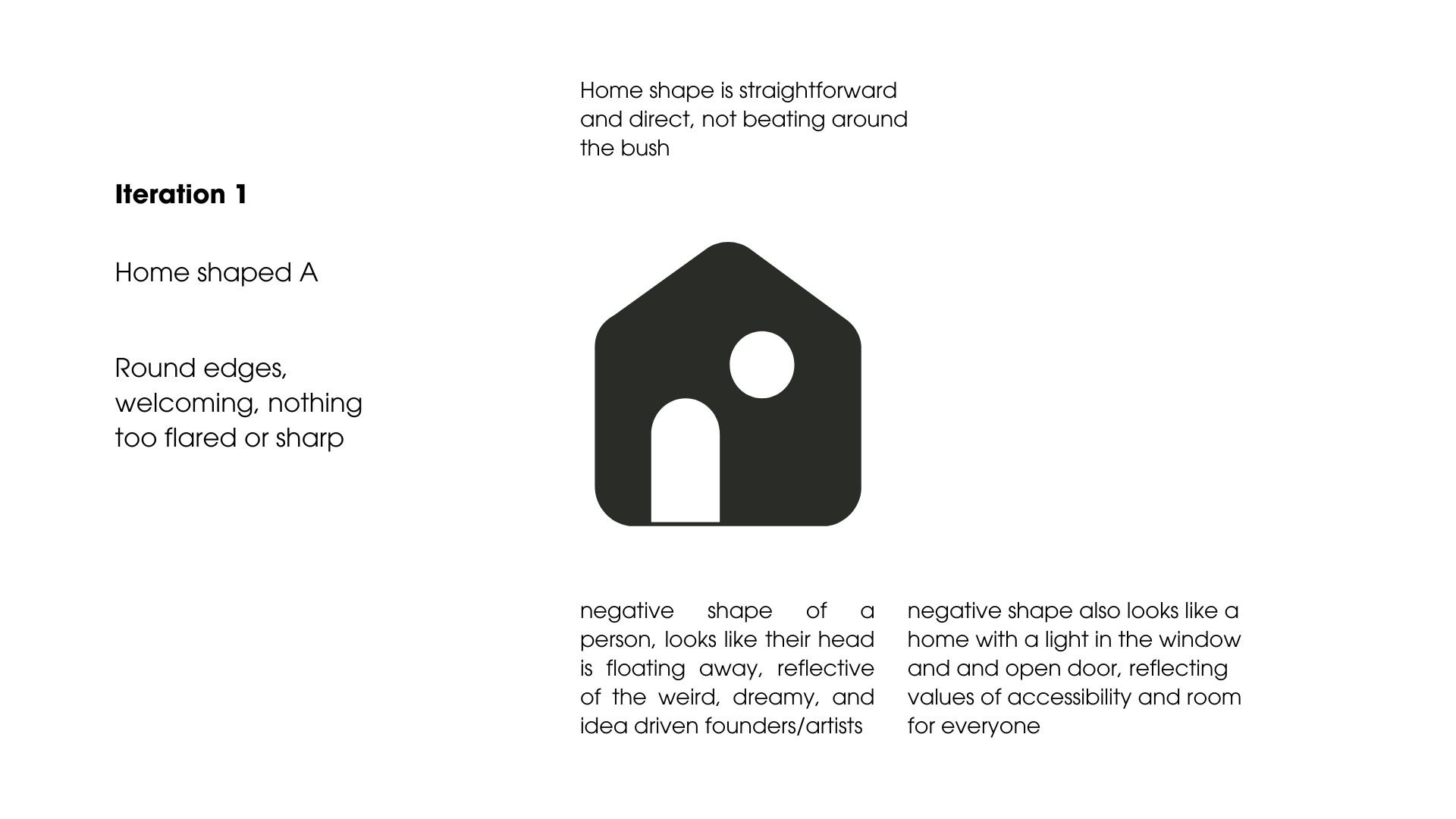
The first round cast a wide net — three icon directions, multiple typeface pairings, color palettes, and stamp marketing concepts. The goal wasn't a final answer, but a set of credible directions to pressure-test with the client.
Three icon directions explored: a shelter/home metaphor referencing asylum as refuge, a door/threshold mark representing the moment between worlds, and a modular form that reads simultaneously as an architectural block and a letterform.


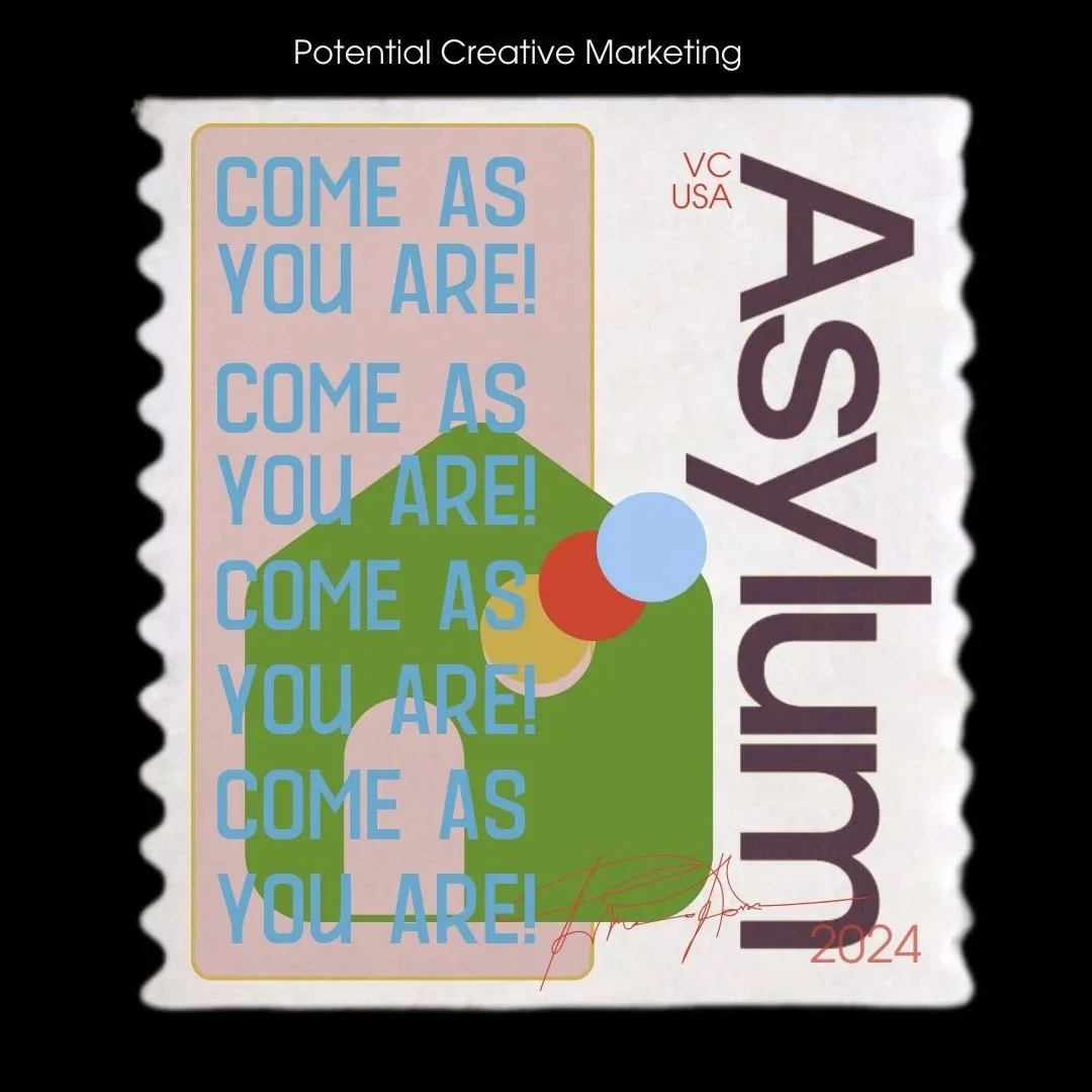
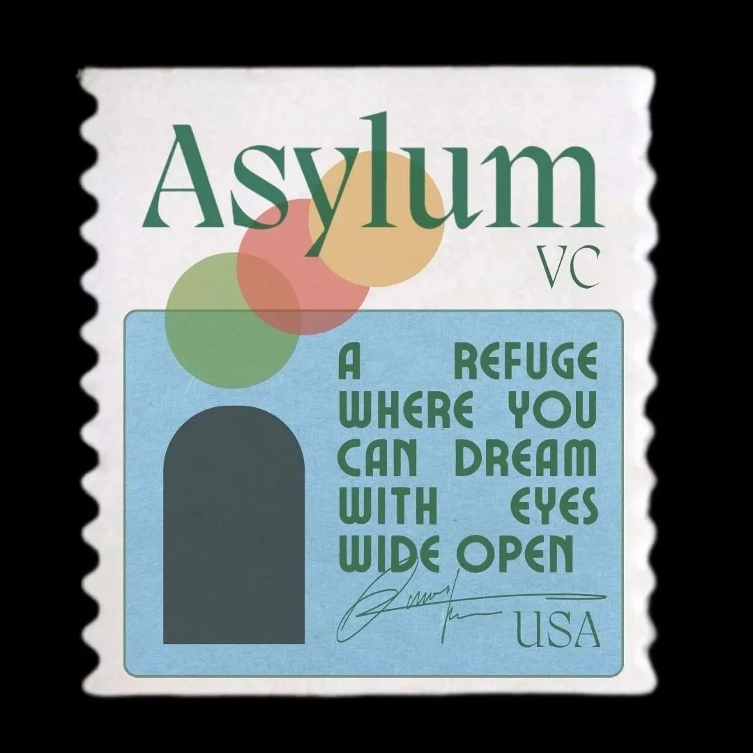
One of the most resonant ideas from Round 1 was the stamp format — collectible, tactile, and full of brand personality. Each stamp functions as a standalone marketing asset, stamped with Asylum's voice. Along with this I created a mockup letter from the founders.


- Too playful, too feminine — client preferred monochromatic black and white
- Typewriter typeface was "too on the nose" for the letter concept
- Gothic type read too close to an existing competitor
- Clients not unified on graphic aesthetic direction
- Bare-bones, hand-drawn aesthetic felt raw and authentic — reflected the firm's values
- Designs were accessible and inviting
- Stamp concept was strongly received as a marketing asset format
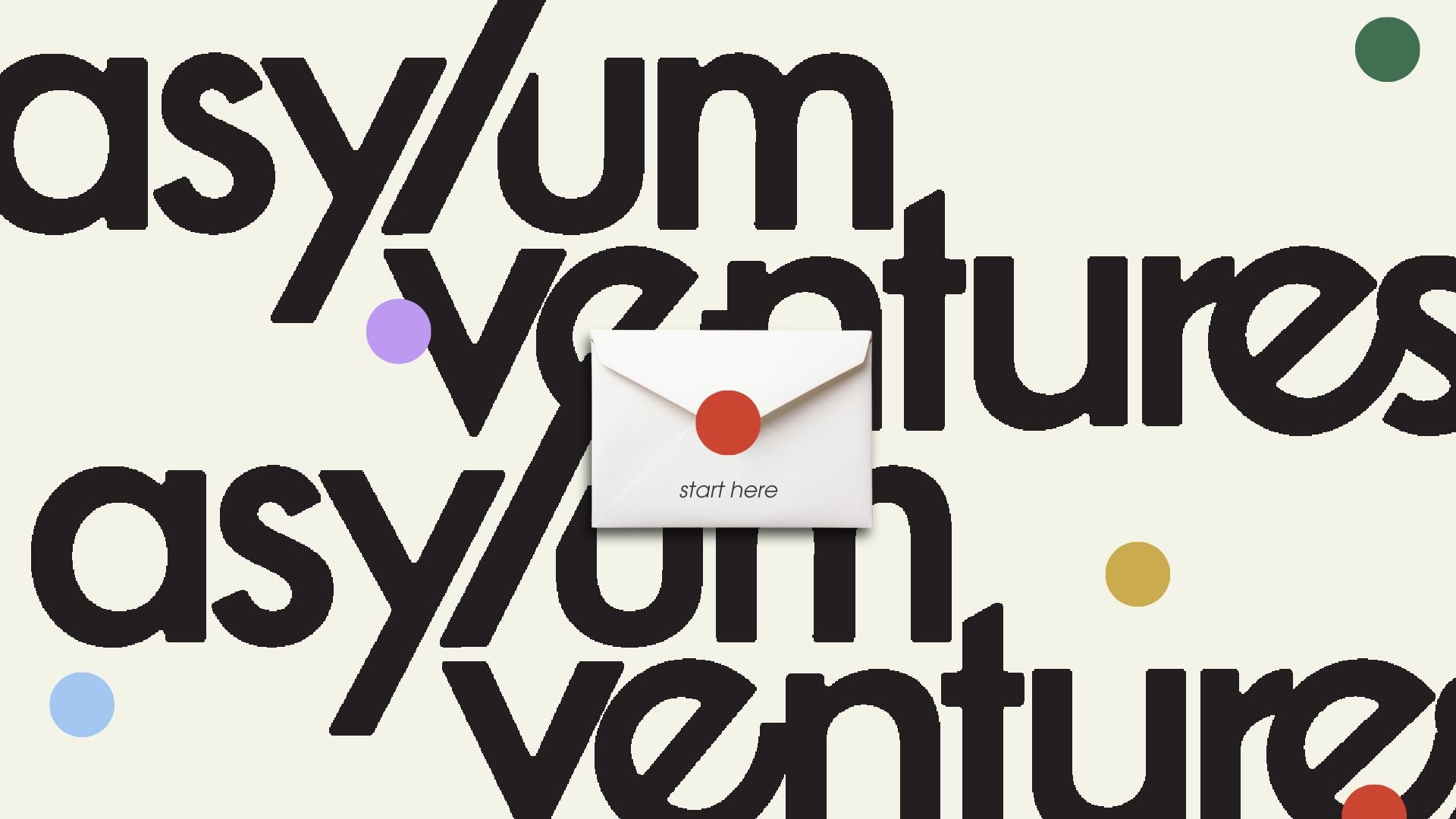
- Letter/hero page concept resonated — the form, not the typeface
Moving forward: Due to a new restricted timeline, deliverables narrowed to a wordmark and hero page for the website. The client wanted to communicate a letter format — subtle, not literal. They liked the idea of blackletter typefaces and a paper-like texture throughout.
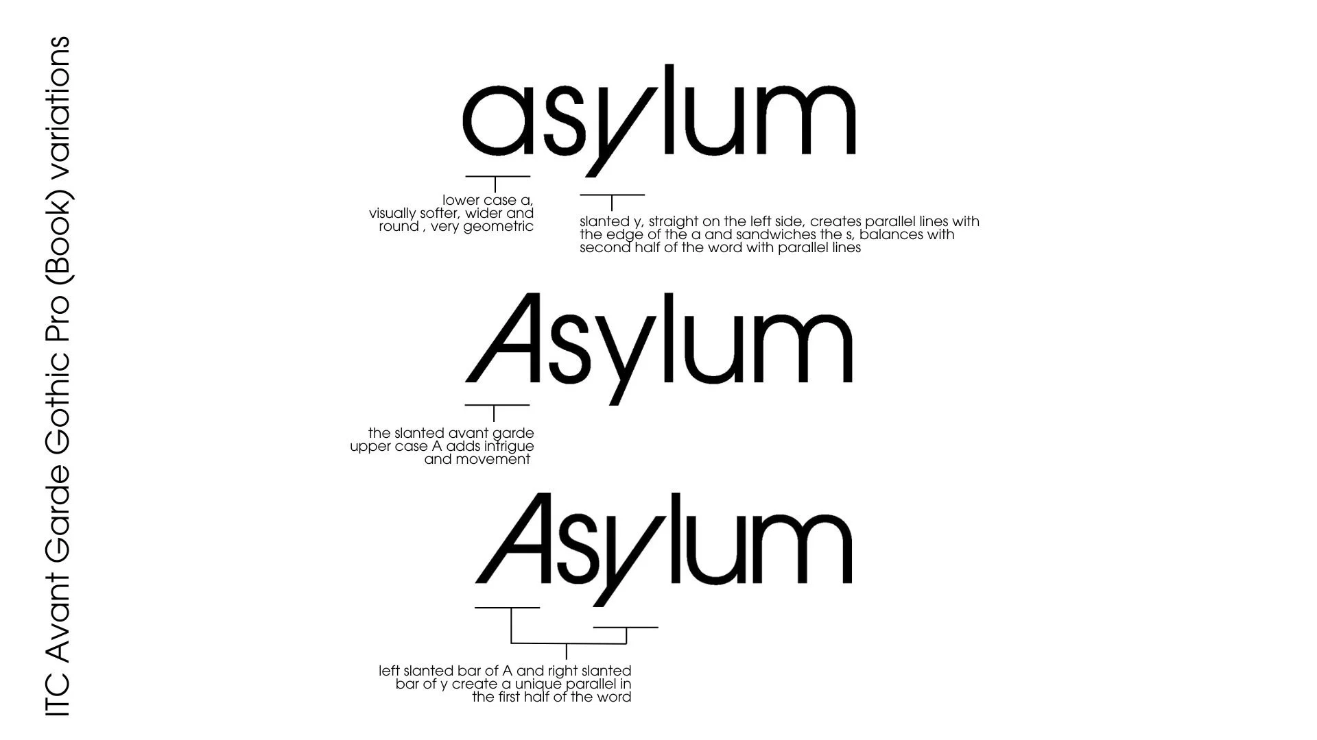
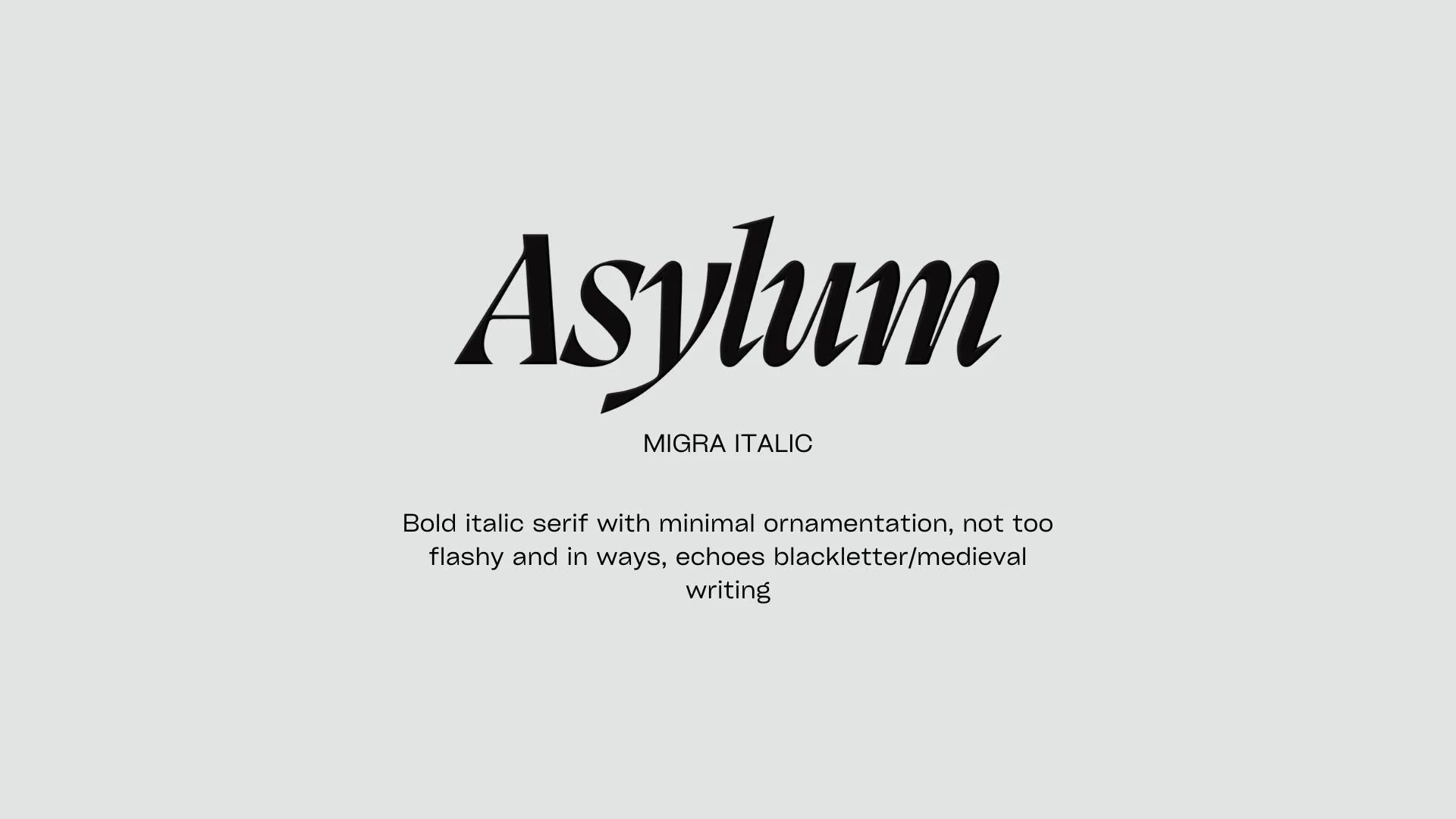
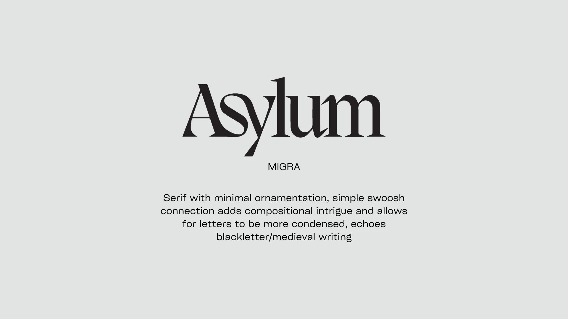
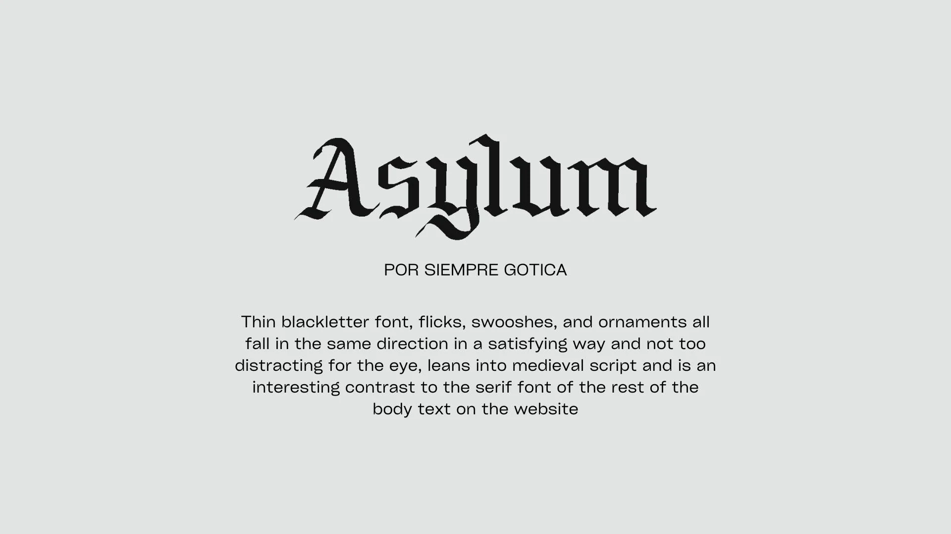
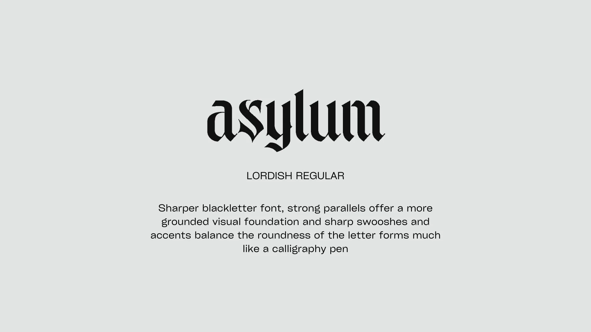
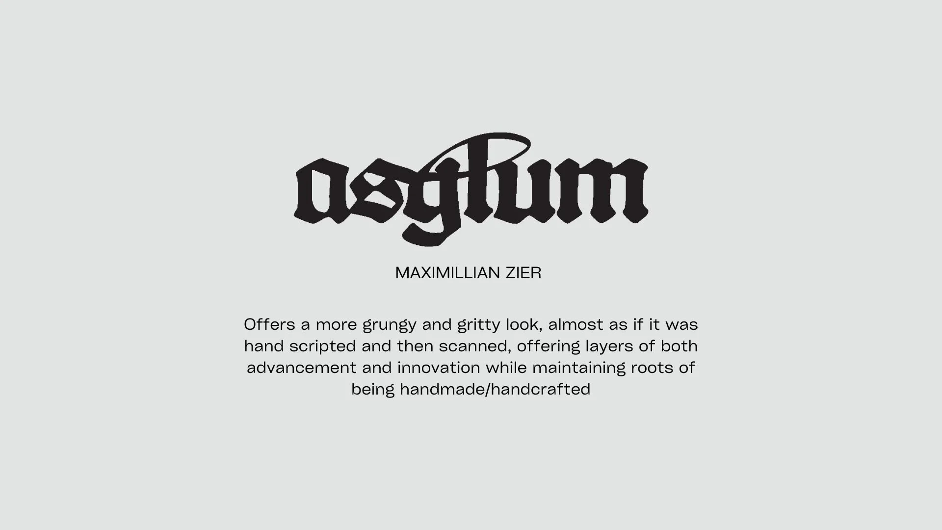
Wordmark Exploration — 5 Typeface Directions
Five typefaces were researched and presented, each with specific rationale around how the letterforms related to Asylum's identity. The blackletter direction pushed into territory that genuinely defied the polished, corporate VC aesthetic — that friction was the point.
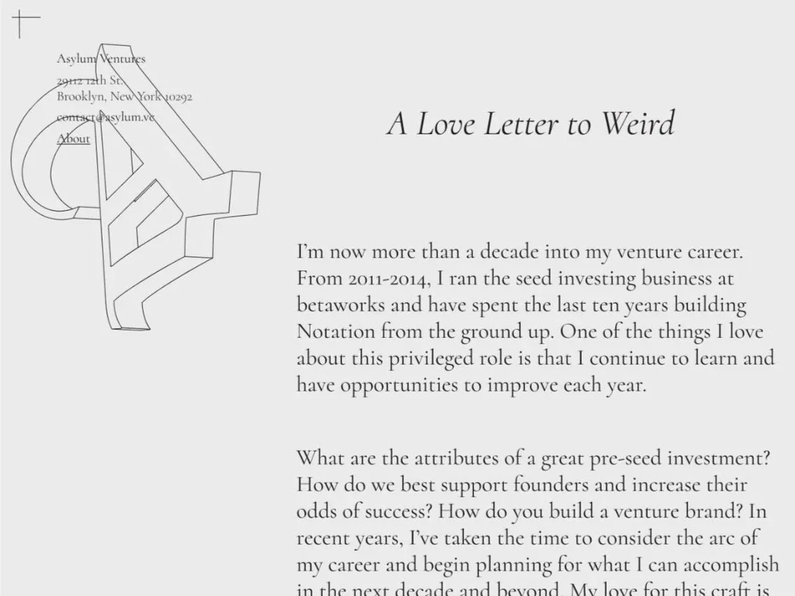
A Love Letter to Weird.
The hero page was built around real content from the client — a founder letter titled "A Love Letter to Weird." The design challenge: make the page feel like a physical letter without resorting to obvious visual metaphors. Two complete layouts were developed, each paired with a different wordmark.
This iteration featured a decorative monogram, an oversized, ghosted letterform used as a background element, serves as a watermark, signaling letterhead without mimicking it. Registration crosshairs in the corners give the page a print-production quality, as if designed to be physically stamped and mailed.

Both directions share the same structural logic: letterhead-style contact info at top left, wordmark centered, scrolling letter body. What changes is the personality of the monogram, one is fluid and calligraphic, the other geometric and architectural. Each amplifies its paired wordmark's character rather than just repeating it.


A refuge where you can dream with eyes wide open.
The brand system was complete and production-ready when the client discontinued the project due to timeline constraints, not design gaps. All deliverables were built for real-world implementation across digital and print contexts.