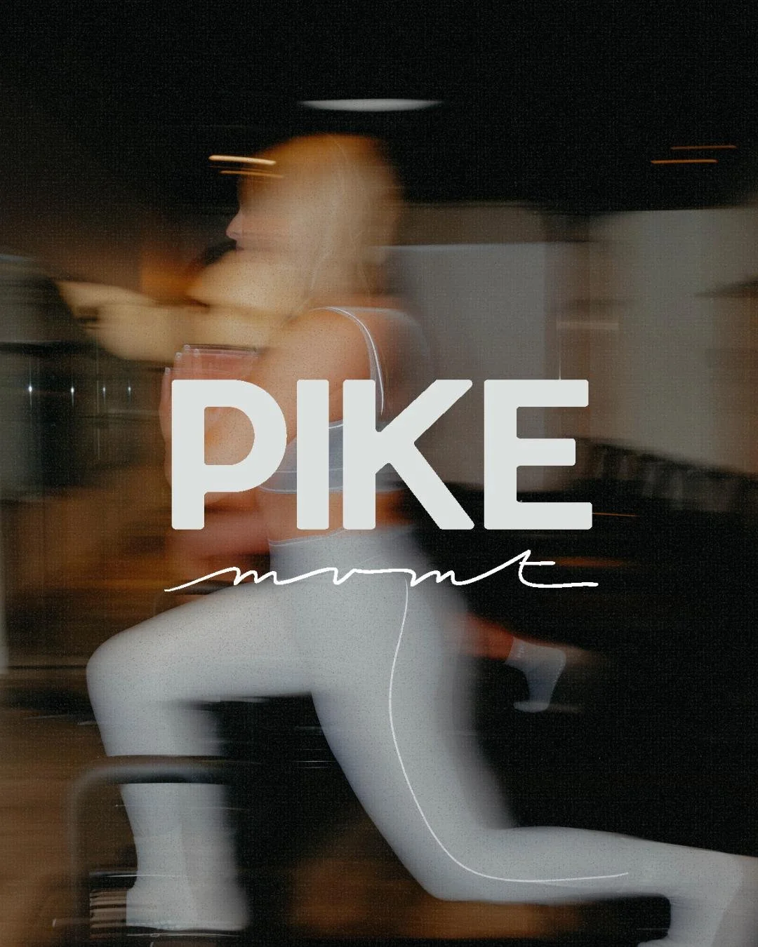
PIKE mvmt
ABOUT
PIKE LAGREE is a Lagree-method fitness studio rooted in the belief that movement is transformative for both body and mind. PIKE Mvmt is an expansion of the brand, to launch yoga sculpt and barre classes in addition to lagree.
ROLE
Logo Designer
GOAL
The brand needed a visual identity that could hold two seemingly opposing ideas: attainable luxury and radical inclusivity.
DELIVERABLES
Visual Identity
Logo/Type System
Mockups/Campaign Concepts
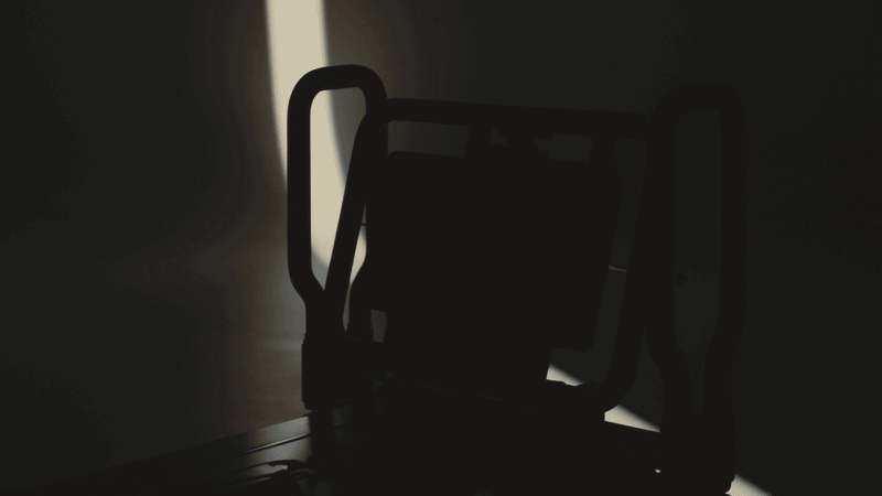
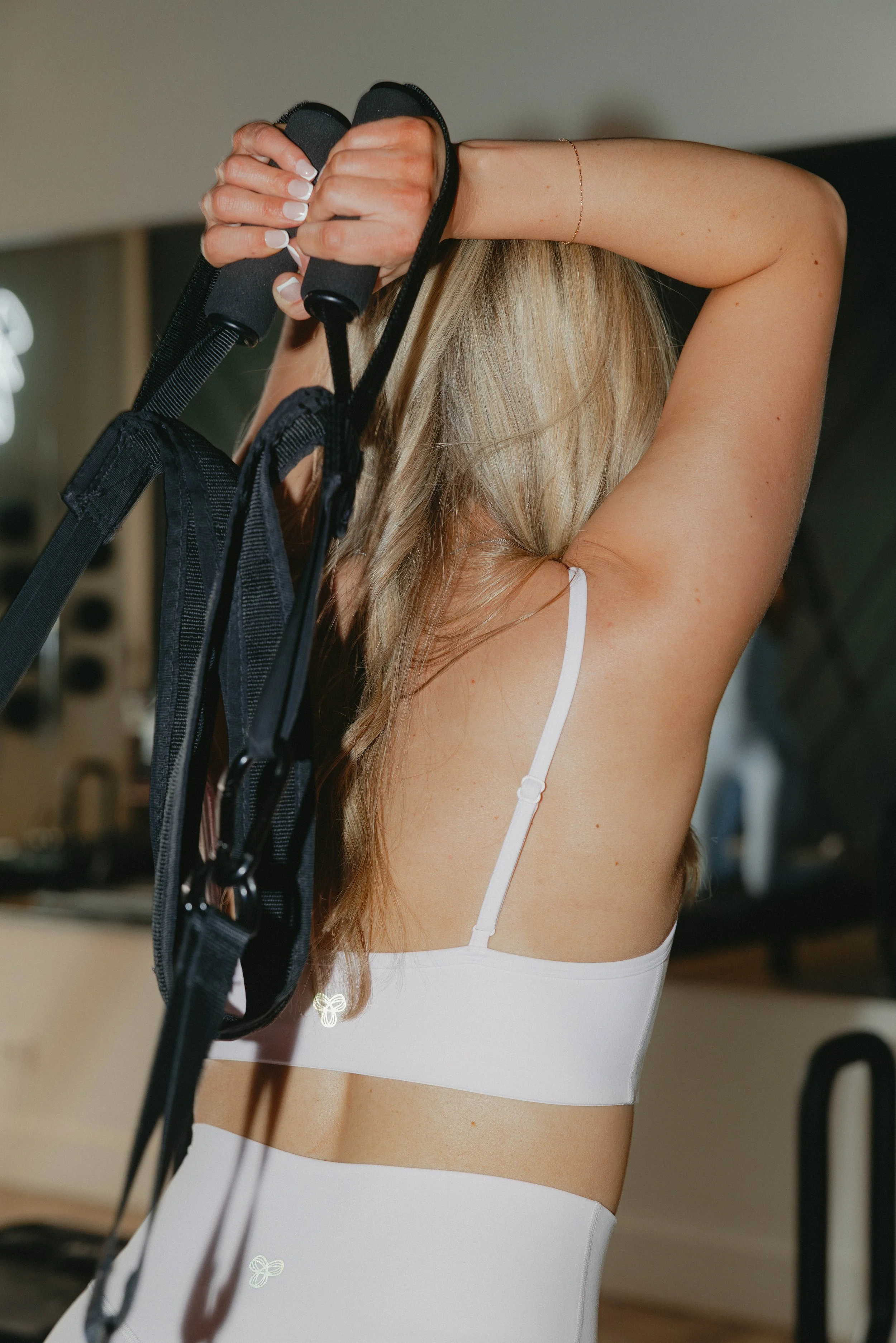
WHO IS PIKE MVMT?A Studio Built on Movement & Intention
With the Brookline Marketing team, we led the full brand identity process, from initial discovery and moodboarding through typography exploration, icon development, and social content strategy. Ultimately we arrived at a logo that speaks in two registers at once: bold confidence up top, human warmth below.
WHO IS PIKE MVMT?Core Brand Values
Before a single letterform was drawn, the brand voice and values were defined. These four pillars shaped every design decision that followed.
01
Aspirational
PIKE MVMT motivates clients to strive for their best while reminding them they already belong here. Growth is the goal, but welcome is the starting point.

02
Transformative
The studio catalyzes change, growth, and a deeper connection to self through movement and space. Every session is a step toward becoming.
03
Elevated
Beautiful design, refined detail, and thoughtful programming that feels both premium and purposeful. Luxury that doesn't exclude.
04
Confident
A brand that knows who it is and what it does well, expressed with clarity, not ego. Warm, approachable, and emotionally attuned.
DESIGN PROCESSHow the work evolved.
01
DISCOVERYBrand Strategy & Positioning
The process began with deep brand discovery: articulating the studio's core values, competitive landscape, and target audience. Benchmarking against major competitors like Solidcore, Club Pilates, and Pure Barre revealed a white space: a brand that could be both genuinely premium and radically welcoming.
02
EXPLORATION3 Moodboard Directions
Three distinct aesthetic worlds were built out to give the client a meaningful choice. Each moodboard represented a different brand personality. Not just a different look, but a different way of speaking to the world.
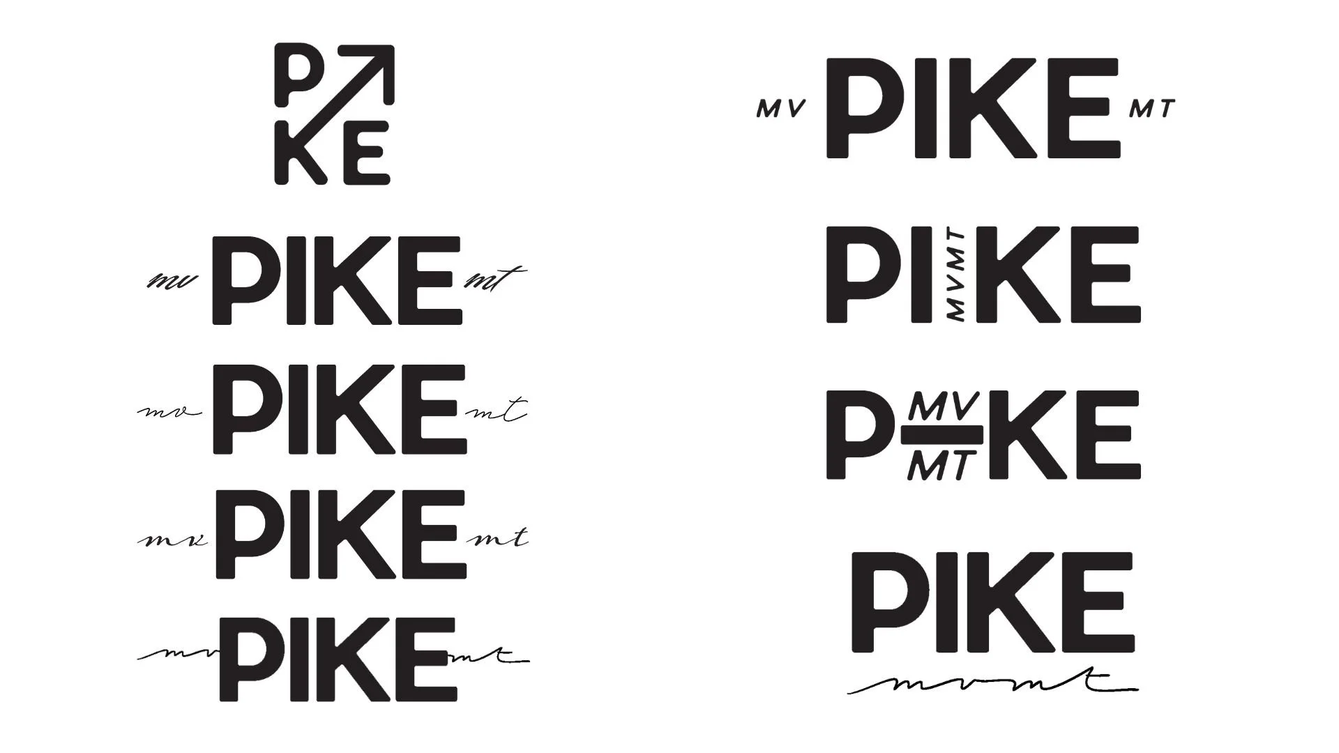
03
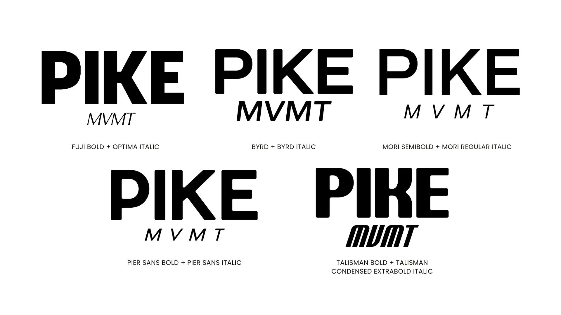
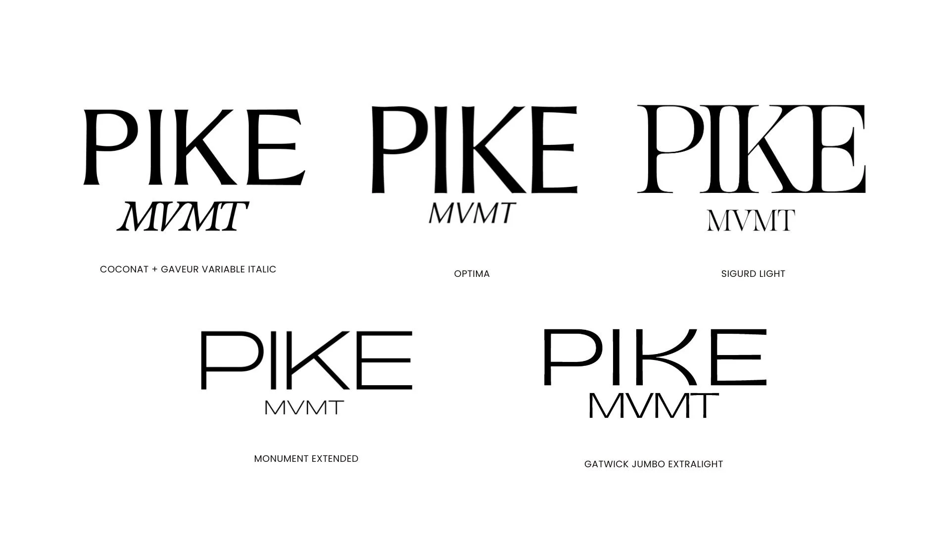
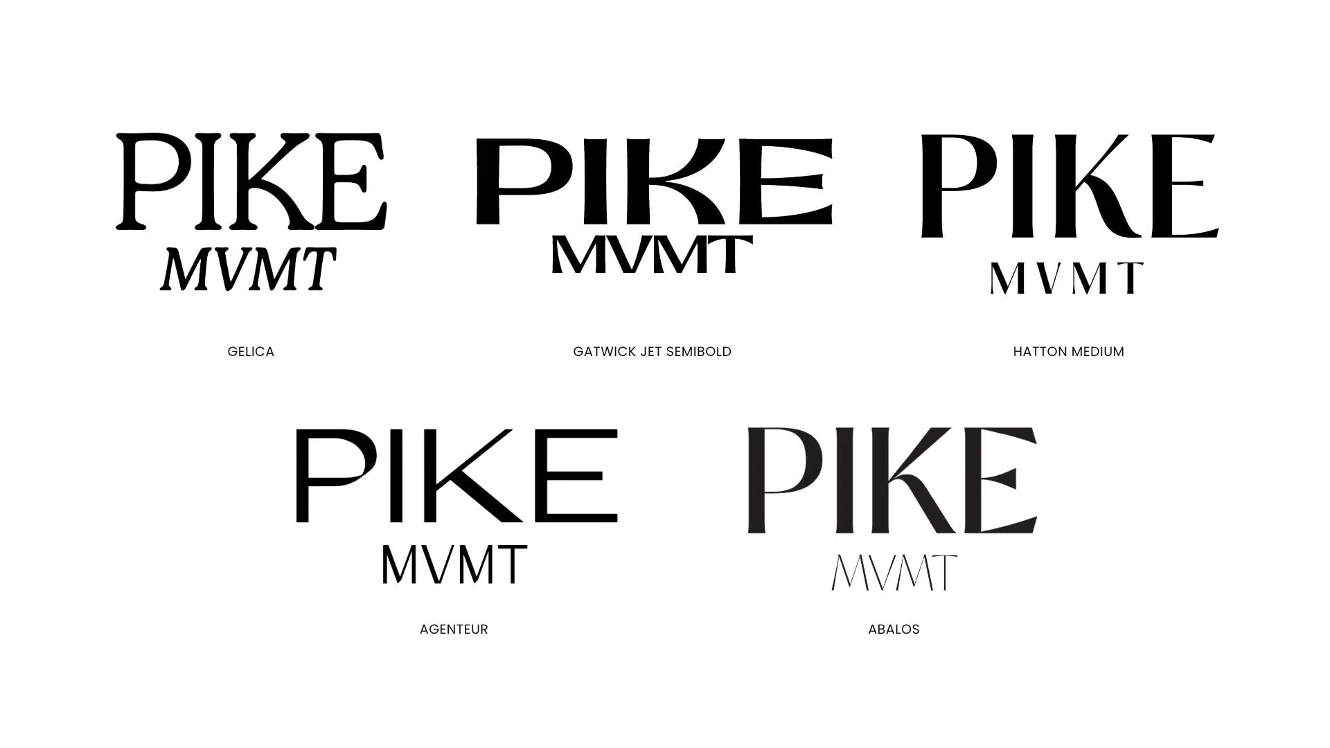
TYPOGRAPHY EXPLORATION15+ Typeface Pairings Tested
Across all three moodboard directions, over fifteen distinct typeface pairings were tested, ranging from Fuji Bold + Optima Italic to Monument Extended, Hatton Medium, Gelica, and Agenteur. Each combination was tested with the actual wordmark "PIKE MVMT" to evaluate rhythm, weight, and personality.
04
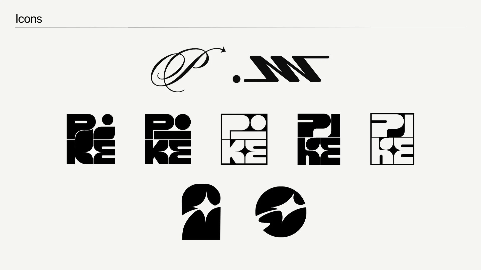
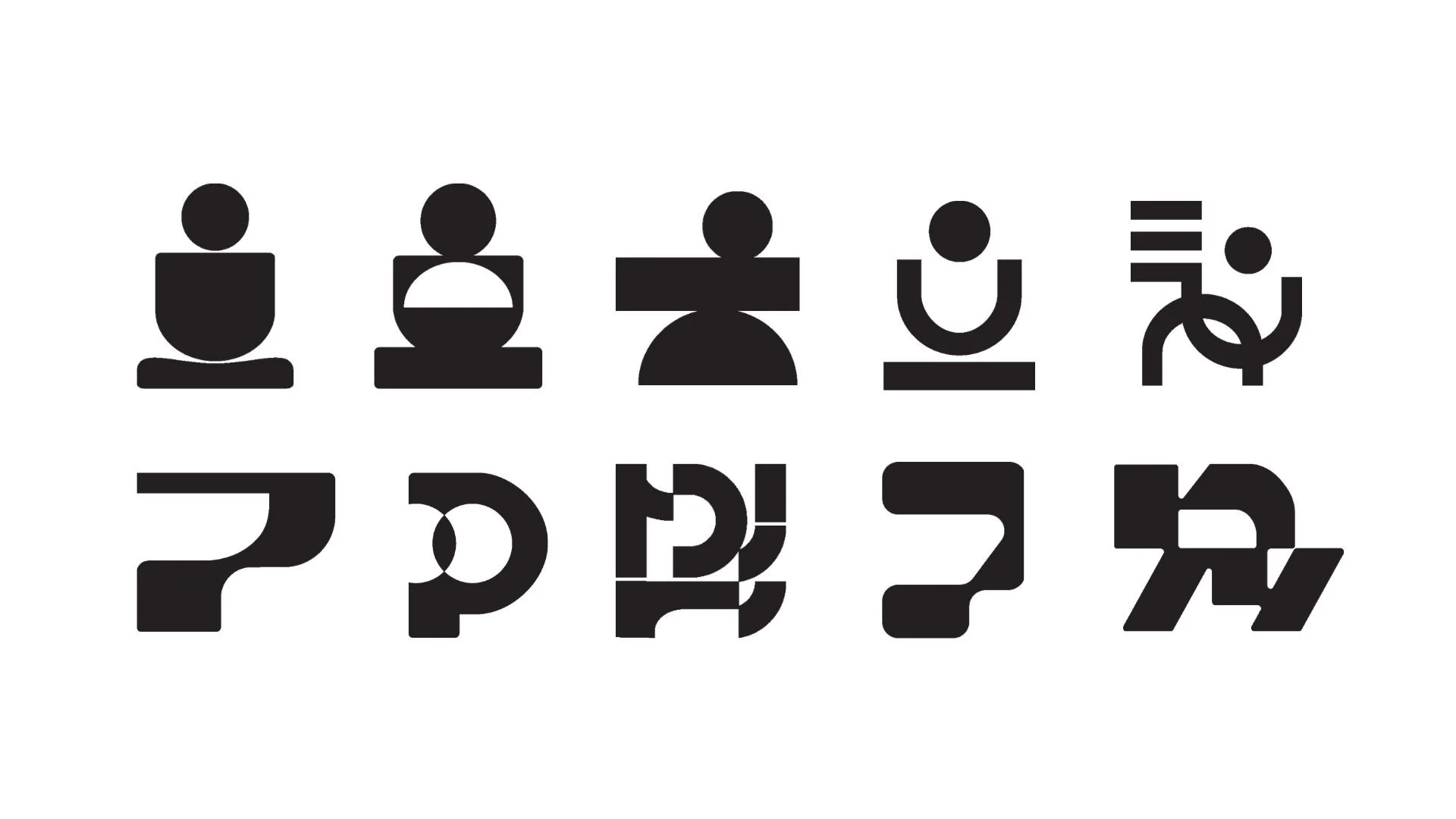
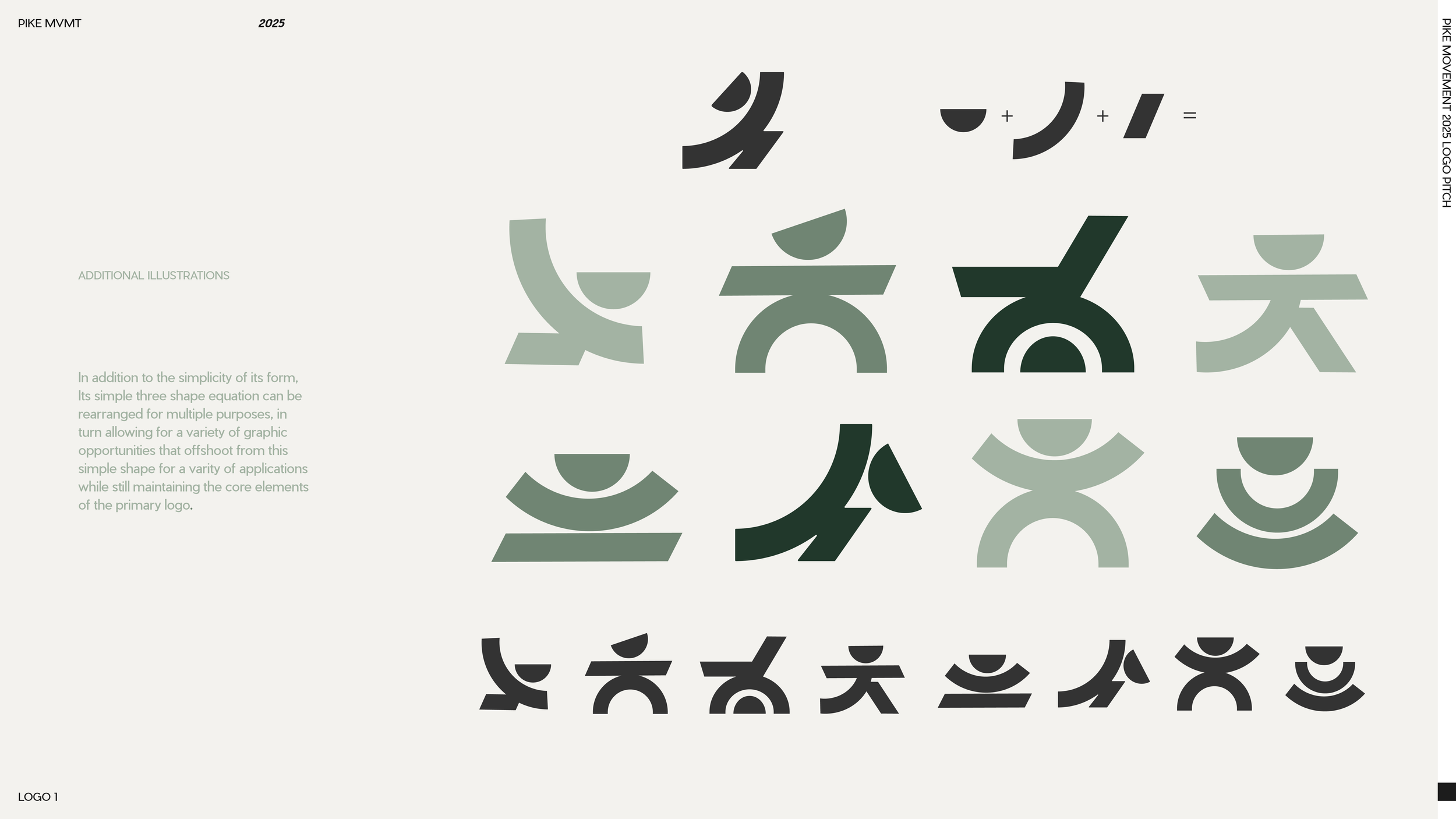
ICON DEVELOPMENT22 Icon Concepts
In Stage 2, a dedicated icon exploration produced 22 distinct mark concepts. Categories explored included abstract P-forms, letterform integrations, spiral and flow motifs, human figure abstractions, and reformer-inspired geometric shapes. The goal: a standalone mark that could function independently across apparel, digital, and signage contexts.
05
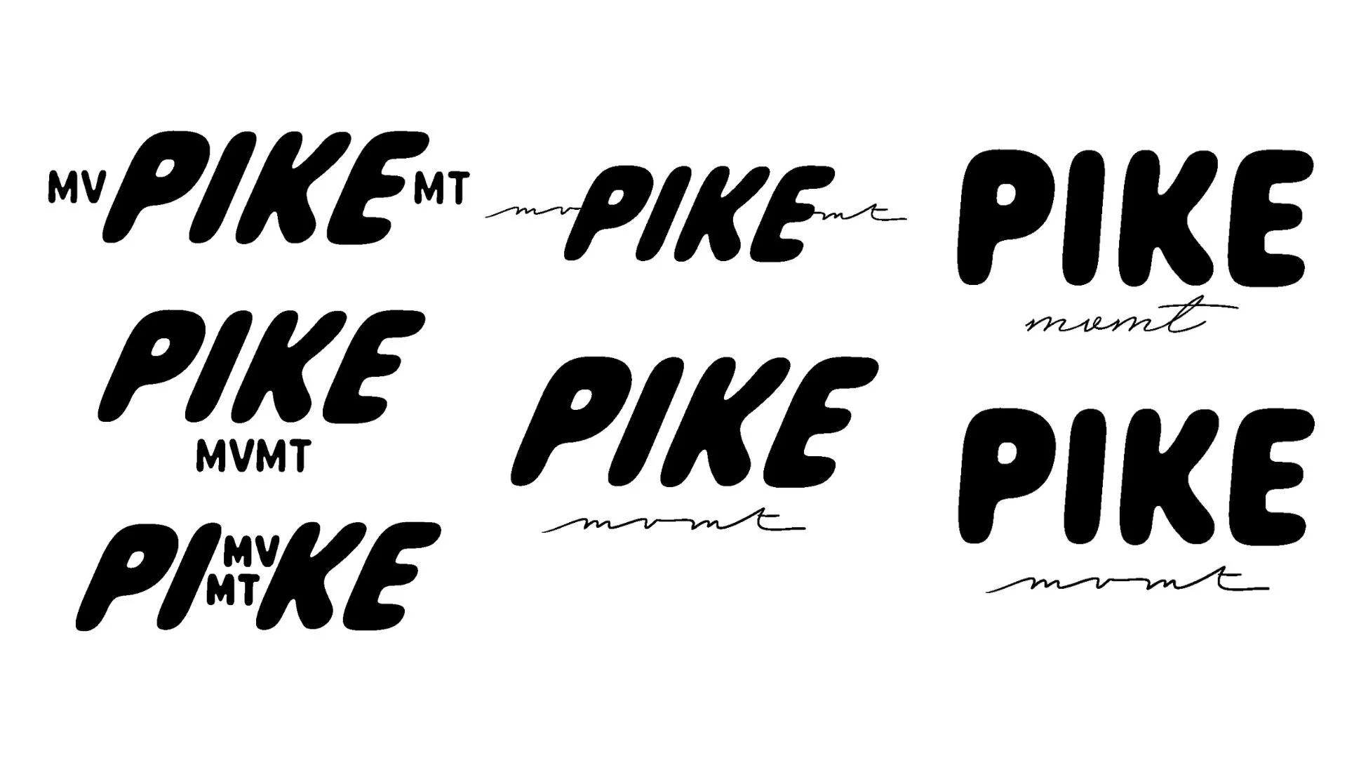
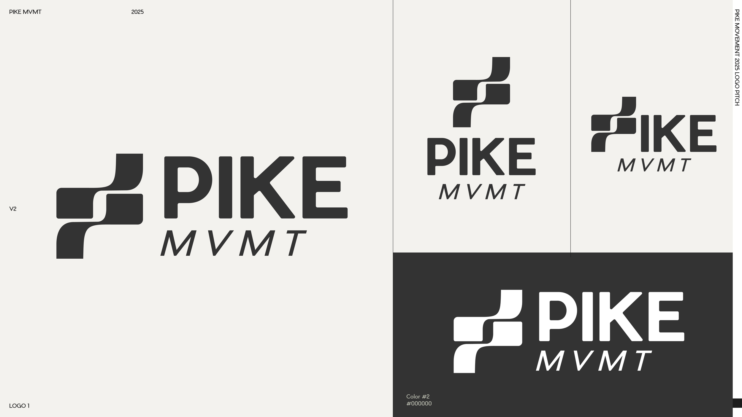
LOGO REFINEMENT — PITCHES 3.0 & 4.0Converging on the Final Mark
Pitches 3.0 and 4.0 refined the logo system in earnest. The "I" in PIKE was explored as a container for "MVMT," arrows and slashes were tested as dynamic substitutes for letterforms, and various script-weight relationships were explored. The final breakthrough came when the bold geometric wordmark was paired with a fluid, handwritten "mvmt", a typographic conversation between structure and movement.
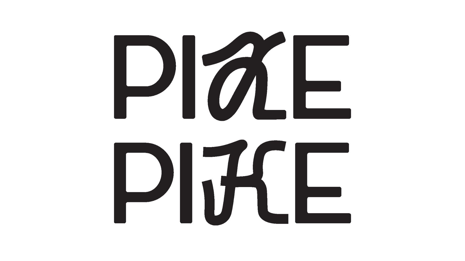
BRAND AUDITWhere We Started

ORIGINAL LOGO
The client's ask was deceptively simple: keep the boldness, but soften the edges. As PIKE grew from a single-method Lagree studio into a fuller movement space, adding barre and yoga sculpt, the visual identity needed to grow with it. The goal was a mark that could feel both strong and soft, reflecting the real experience of transformation through fitness.
ORIGINAL COLOR PALETTE
The existing palette was intentionally muted, but too much so. The client wanted more range: richer, bolder tones that could hold their own in application, without abandoning the modern neutrals at the foundation.
Competitor Identities
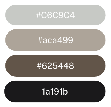
SOLIDCORE
Built on intensity. [solidcore] has carved out a premium position in the boutique fitness market through high-difficulty, low-impact reformer workouts and a brand identity to match, dark, high-contrast, and uncompromising. Its visual language speaks to performance above all else.
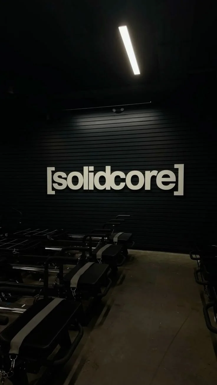
CLUB PILATES
Built on accessibility. Club Pilates leads with inclusivity and approachability, positioning itself as the entry point to reformer-based fitness. Its identity is clean and friendly, but trades premium feeling for broad reach.
PURE BARRE
Built on femininity. Pure Barre's brand leans into its core demographic directly, soft, graceful, and consistently on-message. It owns the barre category visually, but doesn't push beyond it.
Each competitor owns a lane: intensity, accessibility, or femininity. None of them hold all three at once. PIKE Mvmt was designed to live in that gap and evolve as a brand that could feel strong and soft, premium and welcoming, without sacrificing one for the other.
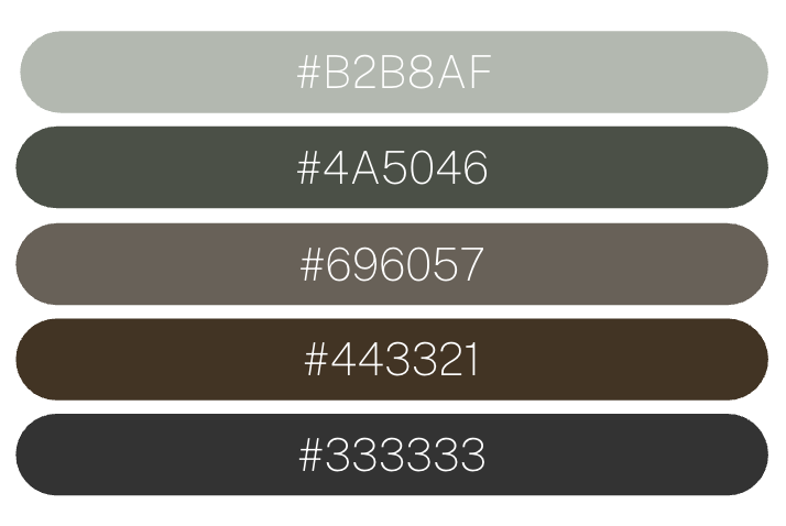
VISUAL IDENTITYRefreshed Color Palette
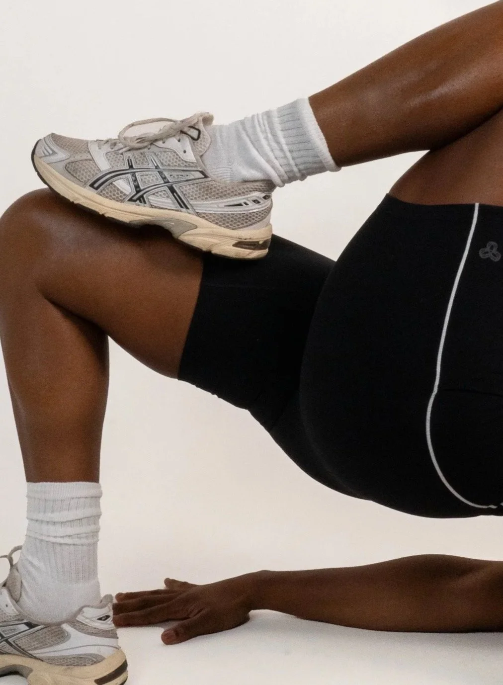
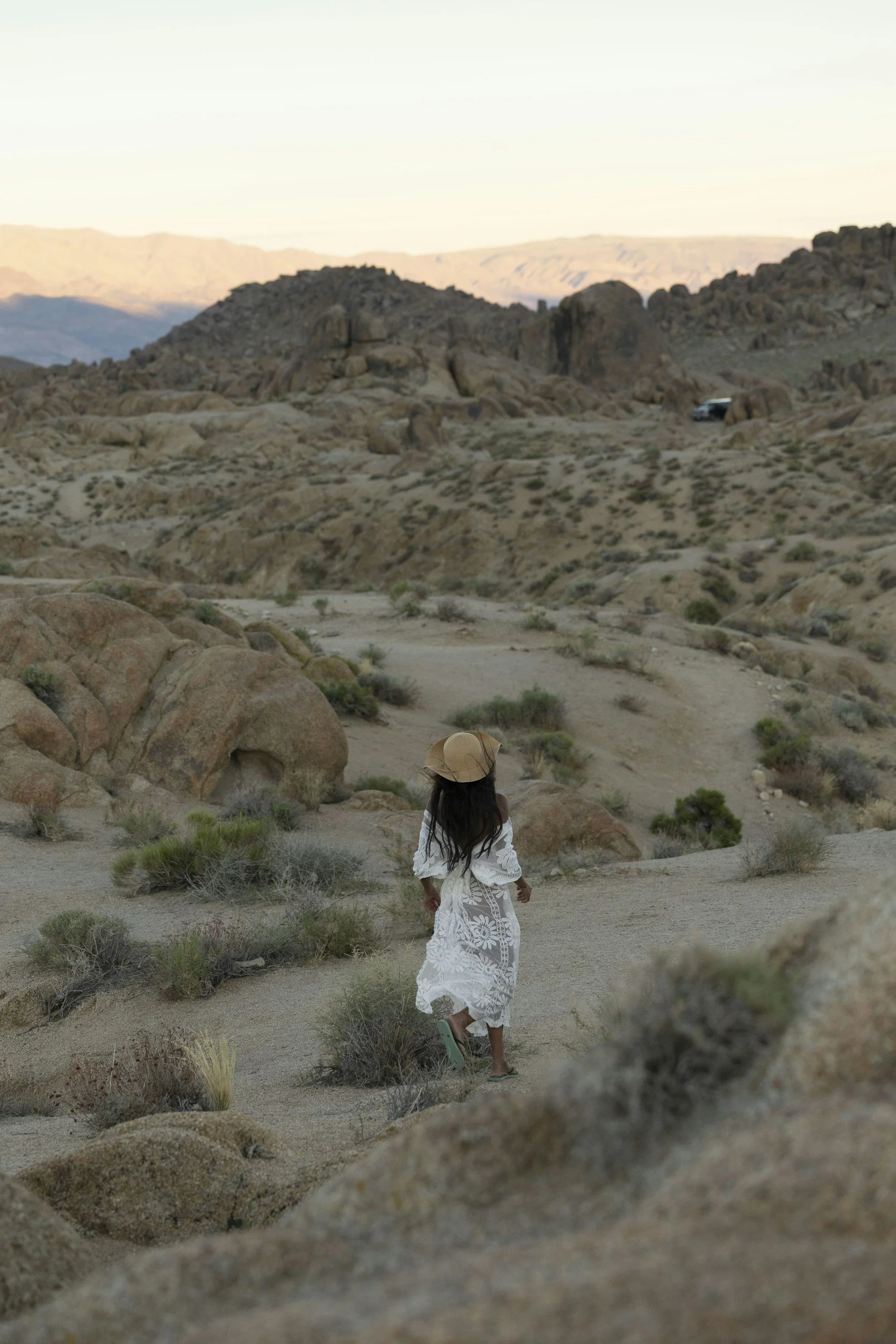
Earthy, modern, grounded, and quietly luxurious. The palette draws from Sedona's layered canyons, sandstone formations, and the soft textures of the studio space itself.
CREATIVE DIRECTIONSThree Worlds Explored
01
Bold, Thick, Geometric
High-contrast, heavyweight forms inspired by the confidence of movement itself. Solid negative space, pure geometry, maximum legibility. This direction would read immediately and command attention on apparel and signage alike.
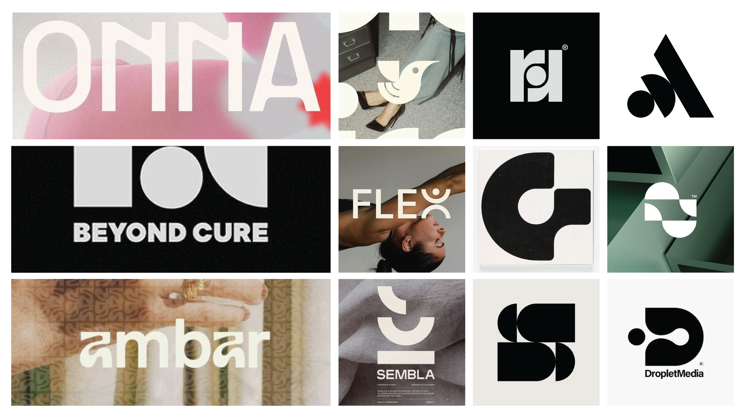
02
Clean, Sleek, Expressive
High-fashion sensibility meets wellness refinement. Thin strokes, dramatic contrast, elevated serif forms. This direction leaned into the "attainable luxury" positioning — closer to a boutique hotel than a gym.
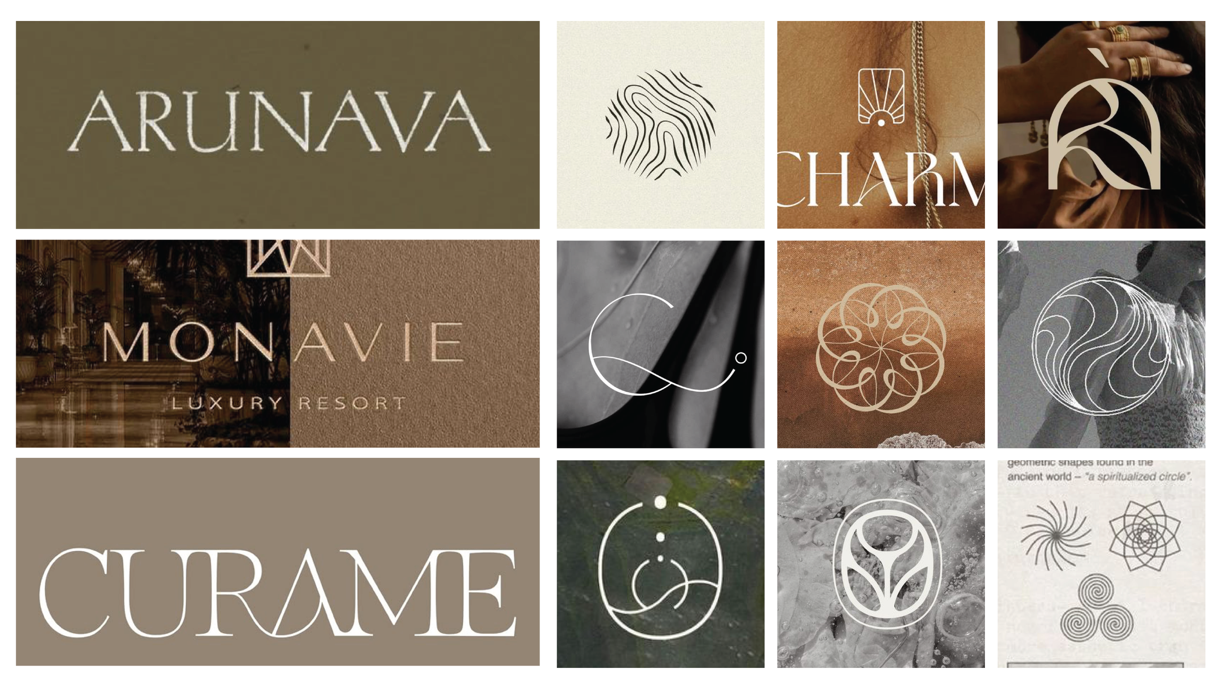
03
Raw, Human, Freeform
Organic, expressive, and deeply textured. Illustrative marks, hand-drawn sensibilities, and warm serif forms. This direction evoked ritual, nature, and community — the feeling of belonging to something alive.
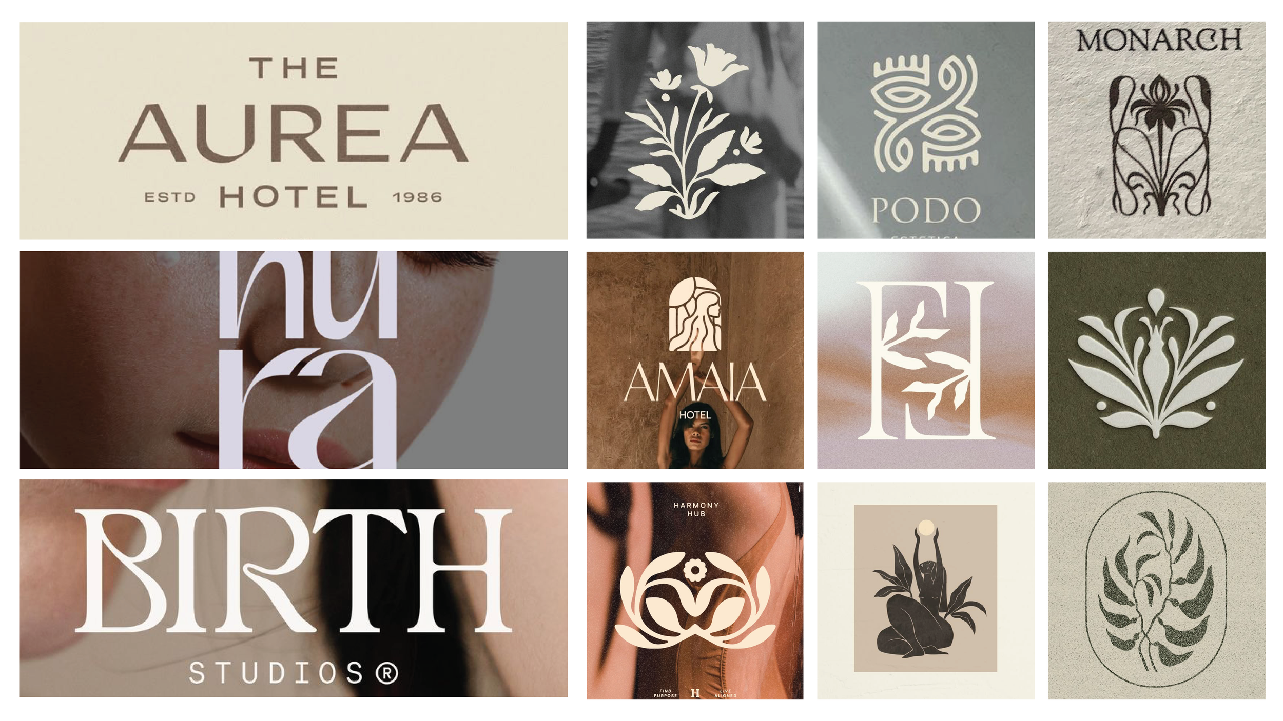
LOGO ITERATIONS
The Path to Resolution
Each pitch round narrowed the solution space and deepened understanding of what PIKE MVMT truly needed to say.
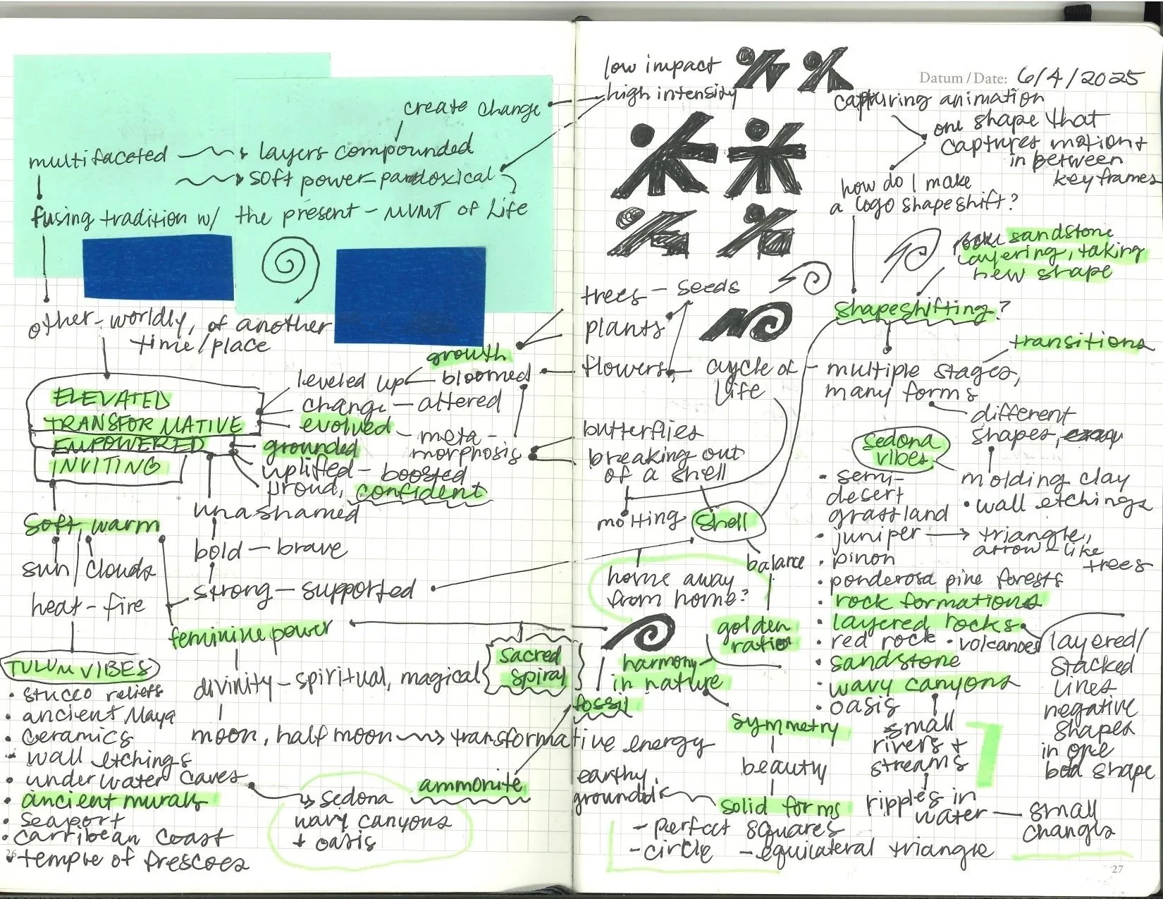
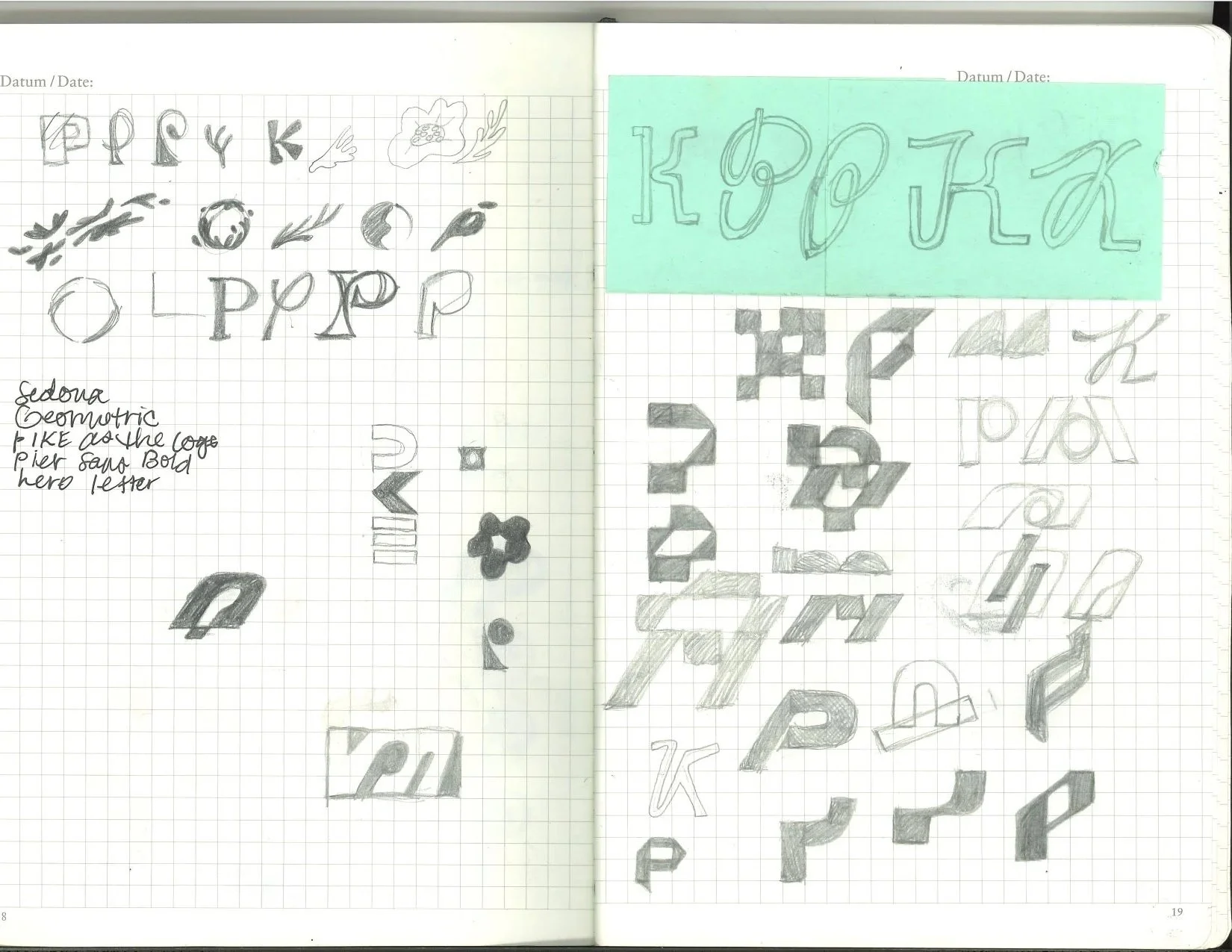
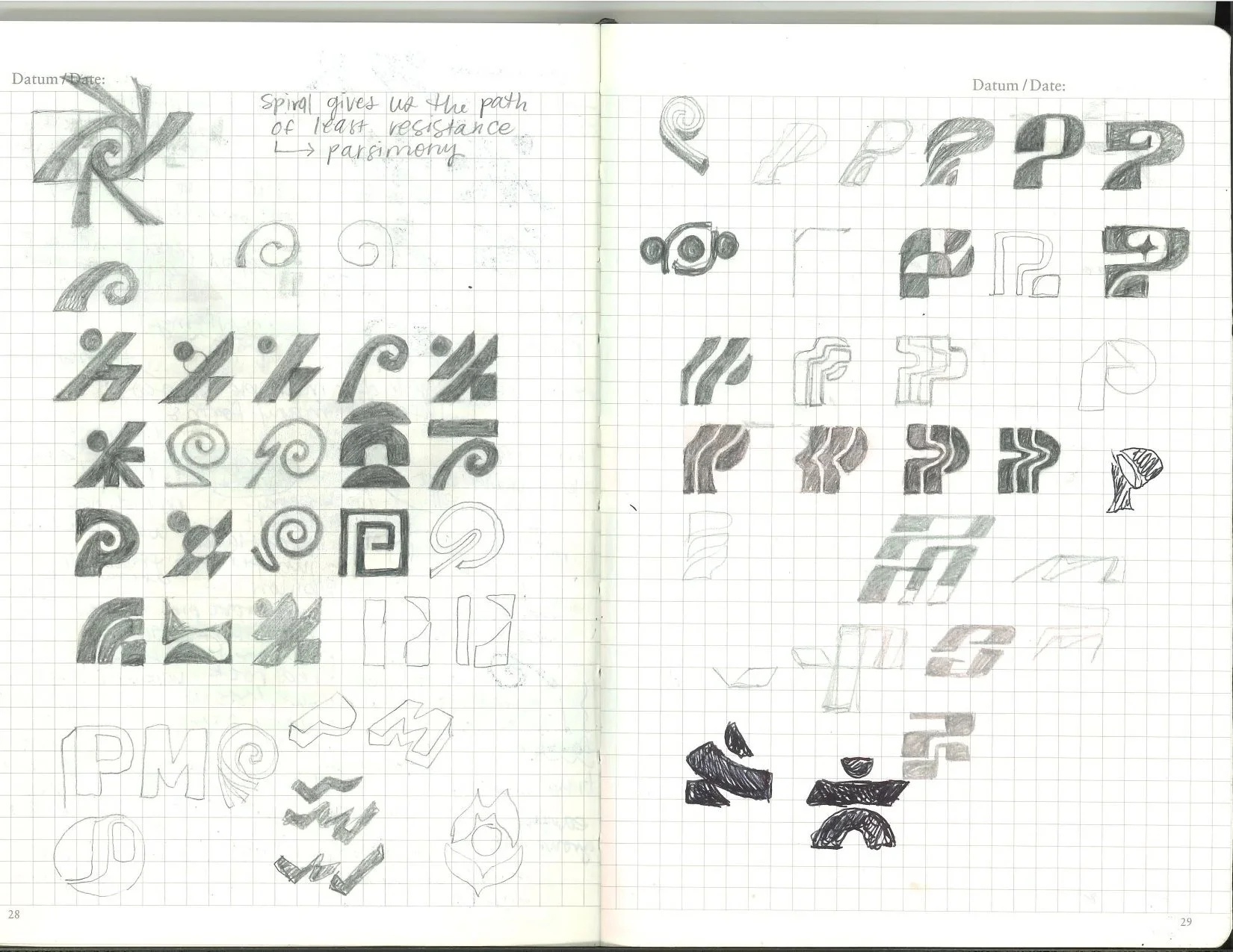
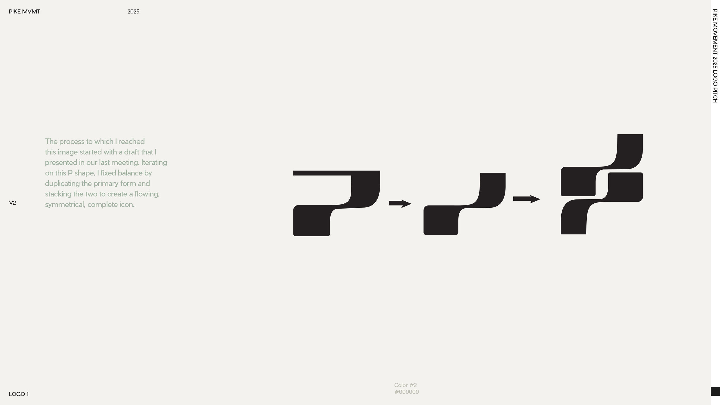
Moving in the direction of a more grounded and geometric feel, I began to play around with a variety of type combinations and icon ideas. My process typically involves a lot of sketching and hand drawn visuals in the beginning stages, which lent well to a brand that is so human focused.
The process of actual development spanned about 4 rounds of continually refined ideas based on client feedback. Here is a progression of some of those ideas!
TYPE EXPLORATION
ICON VARIATIONS
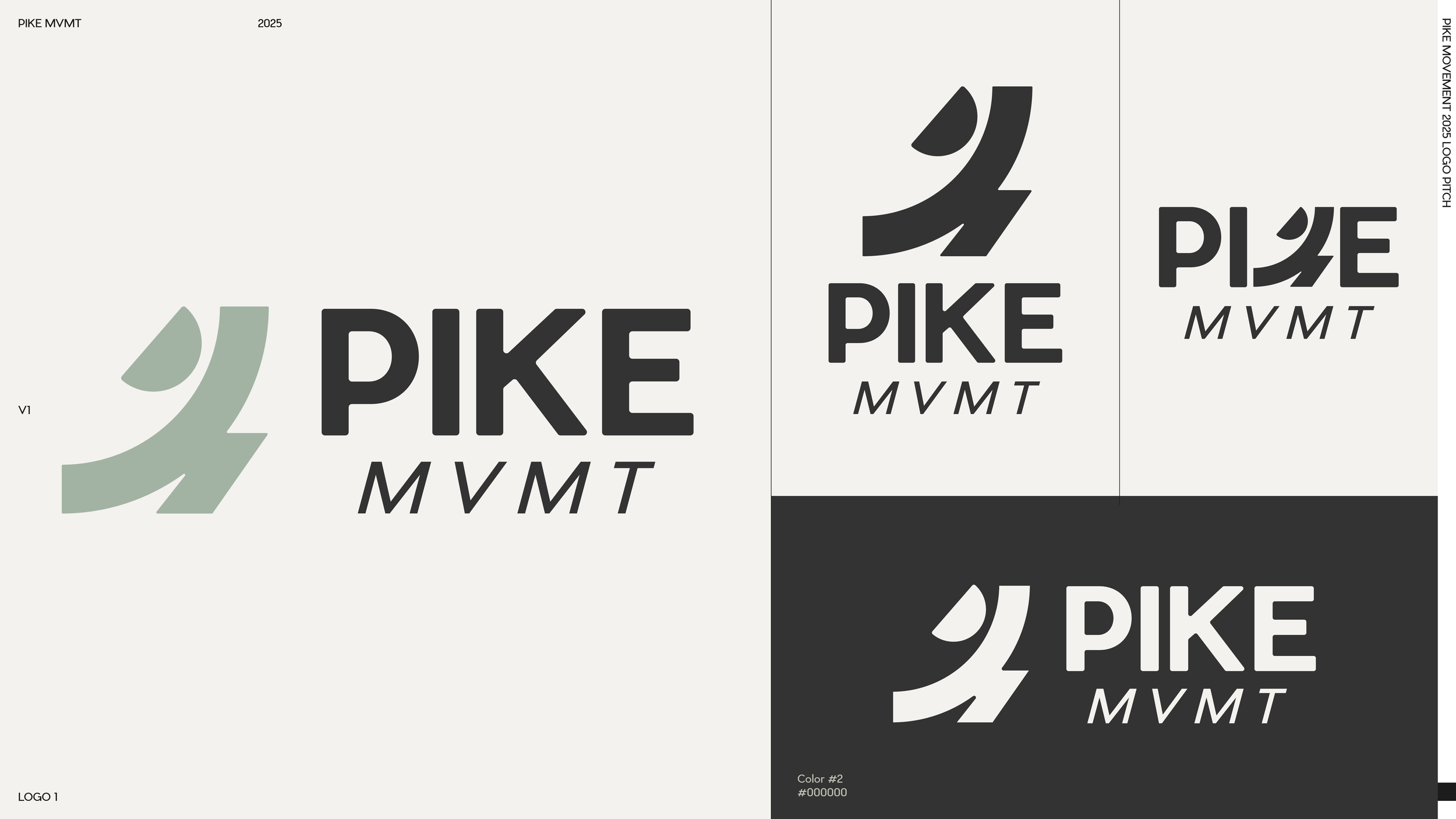
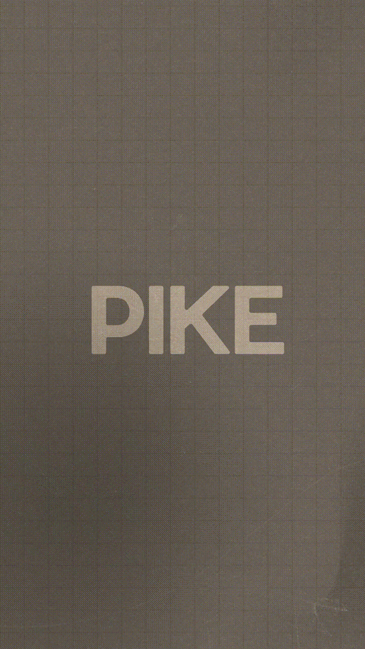
FINAL IDENTITYThe Logo That Landed
The final mark pairs a commanding, rounded-geometric "PIKE" wordmark with a fluid, hand scripted "mvmt" beneath, a deliberate typographic contrast that mirrors the brand's central tension: power and grace, structure and flow, confidence and warmth.
The rounded corners of the bold letters soften the authority of the mark, while the continuous-line script beneath it grounds the whole composition in human movement. Together they read immediately and memorably at every scale.
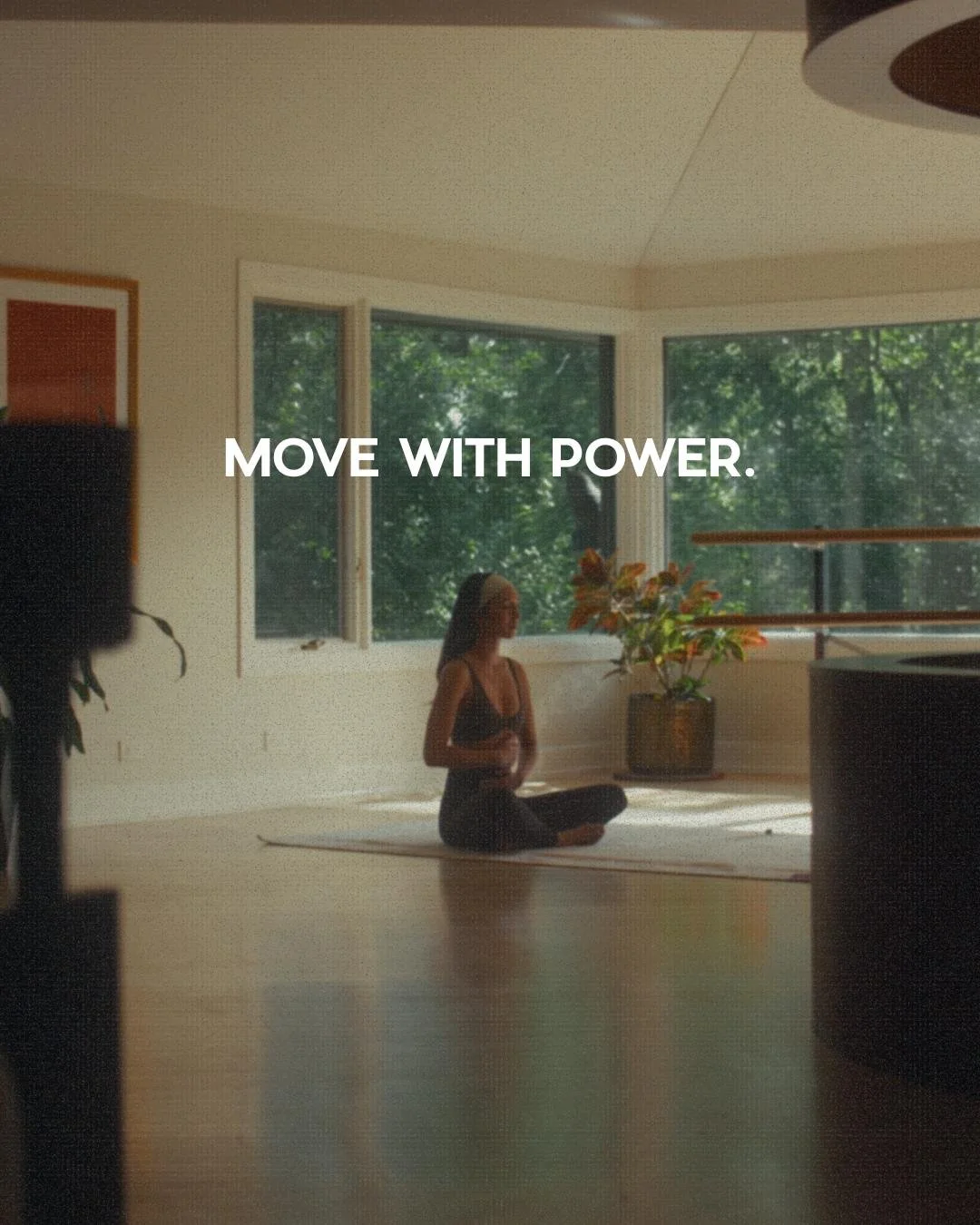
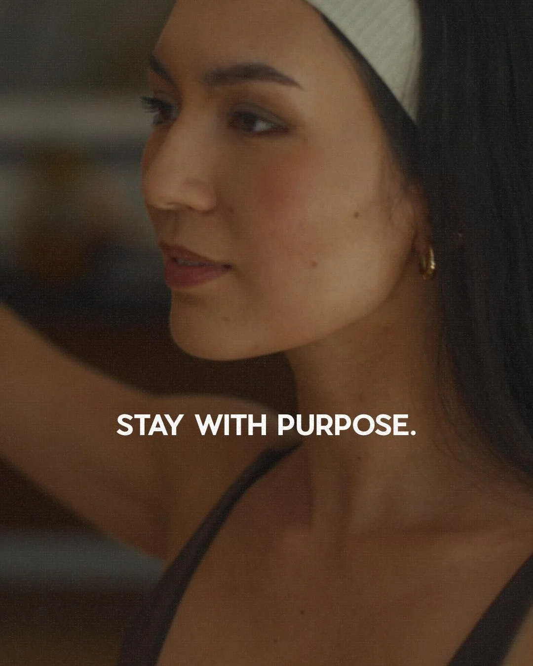
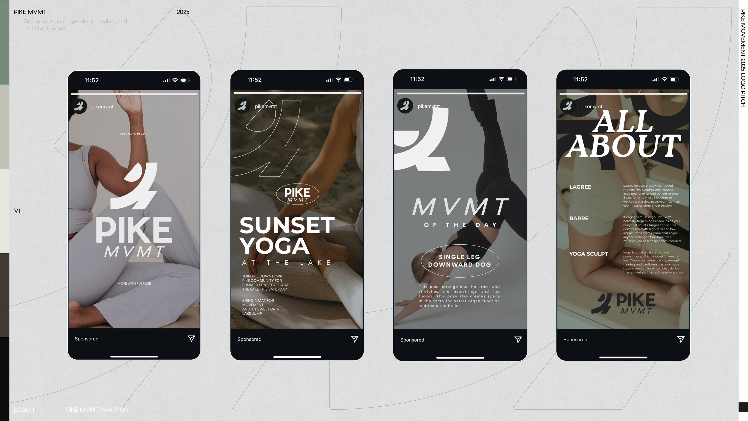
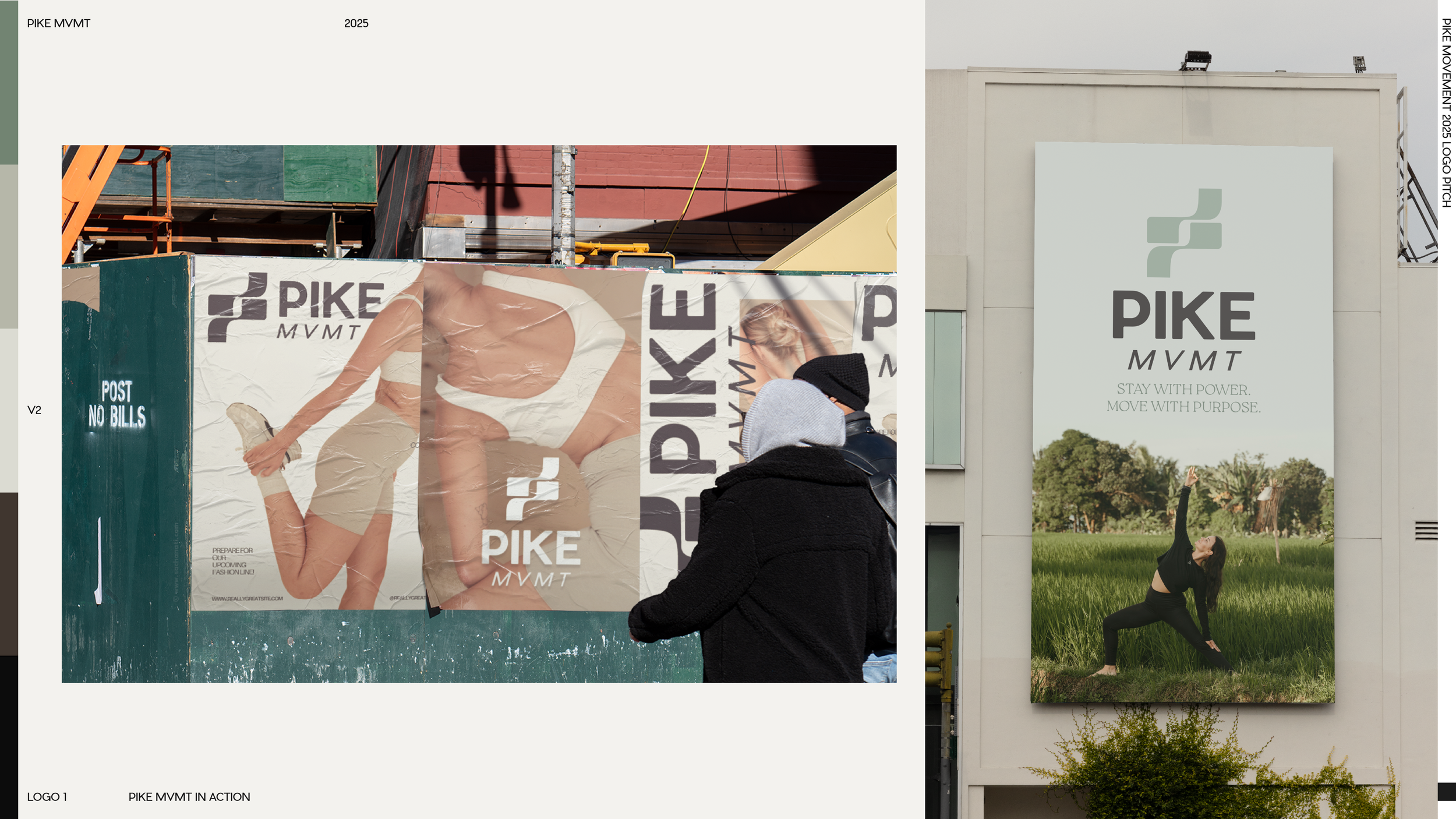
Move with Power. Stay with Purpose.
PIKE MVMT now has a visual language as intentional as the method it teaches. Built to grow with the studio and resonate with every person who walks through the door.
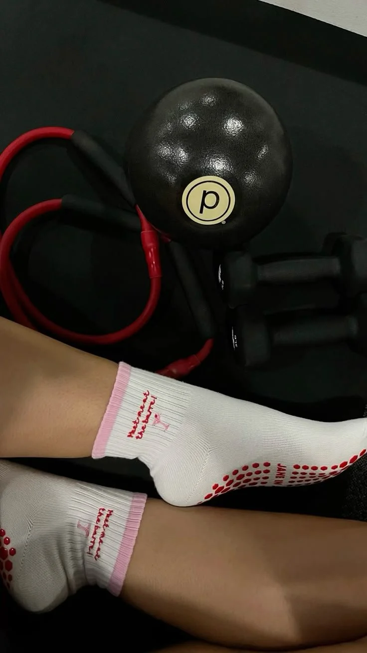
UGC STRATEGY
ALIZA HORNSTEIN
NONE OF THIS WOULD BE POSSIBLE WITHOUT
CLIENT MANAGER
CHRISTIAN VERGARA
FILM DIRECTION
JOE BRACERO
PRODUCER
EMMY NALING
EDITOR
HARVEY MARTINEZ