Outdoer
ABOUT
Outdoer’s mission is to inspire people to spend more time outside by creating stylish, functional gear that elevates everyday moments.
ROLE
Brand Designer
GOAL
Refresh brand messaging, logo, color palette, type system, and and conceptualize campaigns that reflect Outdoer’s values and mission.
DELIVERABLES
Brand Identity
Brand Strategy
Visual Identity
Moodboard
Color Palette
Logo/Type System
Mockups/Campaign Concepts
WHO IS OUTDOER?Outdoer is an outdoor lifestyle brand with a bold premise: gear that moves seamlessly from mountain trails to living rooms, designed to be beautiful anywhere.
When the original branding, (bright teals, hot oranges, stark contrasts) stopped reflecting that vision, the brand needed a complete identity overhaul. This project encompassed research, strategy, moodboard exploration, color system development, logo design, and a comprehensive brand guidelines document.
ABOUT
The Challenge
The brief sat at an intersection of competing tensions: Outdoer needed to feel elevated without feeling exclusionary, nostalgic without feeling dated, and distinctly outdoorsy without looking like technical gear. Two conventional categories, outdoor brands and luxury brands, had well-worn visual languages. The goal was to push past both.
BRAND AUDITWhere We Started
01
It looked like every other outdoor brand
The mountain-peak icon, teal and orange colorway, and bold all-caps wordmark placed Outdoer squarely in the same visual territory as REI, Columbia, and dozens of mid-tier outdoor retailers. For a brand explicitly trying to carve out a new category: elevated, lifestyle-first, aesthetically driven. This was the opposite of differentiation. A customer scrolling past it would have no reason to look twice.
02
The palette said "gear," not "lifestyle"
Black, teal, orange, yellow. These are the colors of safety vests and trail markers, not elevated outdoor living. They're functional, high-contrast, and utilitarian by design. The founder's own words described the brand as "elevated, intentional, classy", none of which this palette communicated. There was a fundamental mismatch between the brand's stated personality and its visual expression.
03
The typography had no personality
Montserrat Bold and Poppins are workhorses. They’re reliable, readable, everywhere. That ubiquity is precisely the problem. For a brand trying to stand for craft, intention, and a distinct point of view, generic sans-serifs flatten everything into the same register. The type system offered no warmth, no heritage, no surprise. It communicated competence, not character.
04
The logo told the wrong story
A mountain-and-sunrise icon is one of the most overused motifs in the outdoor category. It signals ruggedness, nature, peak performance, and not the glamping trip down the PCH that actually inspired the brand. The original logo positioned Outdoer as a gear brand competing on trail credibility, when the real differentiator was taste, aesthetic, and a lifestyle the target audience already lived.
Before the new identity could be built, it was important to understand exactly what wasn't working and why. The original Outdoer brand system had a clear problem: it communicated the wrong thing entirely.
DISCOVERYClient Questionnaire
Before any design work began, the client questionnaire gave the founder something rare: time and space to think beyond the product catalog, to imagine not just what Outdoer sells, but what it means.
“There was a lot of thinking that I put into this which was great! There were questions I haven’t even thought about before and I liked that push it gave me.”
-
"We were on a road trip from Portland to San Diego along the Pacific Coast Highway. We realized that the gear we had didn't match the feeling and vibes we wanted. We wanted better gear that looked good, felt good, and still worked well."
-
Inspire people to spend more time outside through stylish, functional gear that elevates everyday moments. Focused on intentional design, quality craftsmanship, and a genuine love for the outdoors.
-
Elevated. Intentional. Classy.
-
Stylish Functionality — gear that performs and looks good.
Elevated Everyday Moments — beach days, bonfires, picnics, weekend getaways.
Premium Materials & Thoughtful Design — every product has a reason behind it. -
A mix of best friend and guide. We want people to trust us and be comfortable, just like you would with your best friend, like a tour guide who becomes a friend."
-
"I want to break the idea that camping is only for people who grew up outdoors or can survive in the woods. You can enjoy the outdoors and still look good while you do it."
-
Ages 20–50 who enjoy the outdoors but aren't hardcore adventurers. Weekend glampers, casual campers, road trippers, and aesthetic-driven active people. They want products that say "I care about how this elevates my lifestyle."
-
Evolve from an outdoor boutique to a store carrying only the highest-quality luxury outdoor items — while changing the way people see glamping as a legitimate, beautiful way to experience nature.

““There’s space for a brand that blends outdoor function with clean, elevated designs. A brand for people who love being outside but still care about quality and aesthetic.””
BRAND AUDITCompetitive Research & Customer Personas
Using TrustPilot, I gathered 300+ customer reviews across Outdoer's three key competitors: LL Bean, Land's End, and Patagonia, and synthesized them into detailed customer personas for each brand.
The insight was consistent: the deepest brand loyalty wasn't driven by specs or price points. It came from emotional connection, nostalgia, trust, and a feeling of being understood. Outdoer had a clear opening to build something these legacy brands had stopped being: trustworthy, personal, and beautiful.
CREATIVE DIRECTIONSMoodboards and Narrative Building
With a clearer picture of who Outdoer was, the work shifted to imagining who it could become.
The alignment built in those early discovery stages proved invaluable. A shared language between designer and founder means less room for misinterpretation and more room for the vision to grow. By the time we reached the creative phase, I wasn’t translating from scratch. I was building on a foundation.
That's where the moodboards began. Because Outdoer's differentiator was never just product, it was a feeling, a way of moving through the world, I made the decision to lead with narrative in tandem with imagery. Each moodboard was paired with a written piece: a short, atmospheric story that gave language to the mood, the emotion, the kind of person who would live inside this brand. The visuals and the words made the abstract concrete, and gave the client something to react to beyond pixels and color swatches.
Two distinct directions emerged from that process.
VERSION 1.0 / COASTAL AMERICANA
VISUAL LANGUAGE
Coastal imagery
Quiet luxury
Old Money
Americana
Film photography/Kodak
Quiet, everyday moments
Soft-spoken magic
Solitude with nature
MOOD & EMOTION
Nostalgia
Wonderment
Spirited
Familiarity
Eccentric Effortless
Homey Relaxed
BRAND VOICE/NARRATIVE
Do you ever think of evenings on the lake, when the stars were too many to count, and a flickering campfire cast golden light across your friends' faces as you all told jokes and roasted marshmallows? And maybe you don't remember all of the punchlines or the details of every story, but do you remember how much you laughed? Those days aren't gone. We carry them with us.
In the attic. vou find the old boxes again.
A familiar sweater, a photo of your dad at the helm of a weathered boat. A patch-worked blanket, fraying at the edges, that once shielded you from ghost stories and summer breezes. These pieces aren't just fabric or thread. They're tokens. Reminders of what endures. Now, we return to those memories. reimagined. Vintage silhouettes meet everyday wear and are built for modern experiences. Sweaters like the one your grandpa lent you after a swim, still warm from the sun. Blankets that feel as lived-in as the ones you wrapped yourself in under starlight. Carefully crafted and timeless. Meant to last. Meant to age with you.
Each piece tells a story, and this time, it's yours.
Built for the everyday. Loved for a lifetime. Made to be inherited.
Outdoer- always outdoing the ordinary.
AUDIENCE/MARKET APPEAL
Leaning heavily on memory and storytelling, it's cross-generational, this narrative tugs at the nostalgic heartstrings of the older generation, inspires the younger generation to dream of this future lifestyle, and emboldens the target audience of 20 year olds - 50 year olds to build this lifestyle.
It sells the nostalgic, sea-driven feel of Americana heritage brands like Lands End, Ralph Lauren Polo, and Tommy Hilfiger with a slight whimsical twist to transport any consumer to a world worth exploring.
VERSION 2.0 / CINEMATIC NATURALISM
VISUAL LANGUAGE
Mirrored reflections*
Portals
Americana
Transpirational, magical elements
Asymmetrical perfection
Cinematic, large scale landscapes
Everyday, casual-wear
Imaginative
MOOD & EMOTION
Inspiration and Aspiration
Natural elegance/Effortlessness
Wonder and curiosity
Wanderlust
Romanticizing the everyday
Reconnection to nature
BRAND VOICE/NARRATIVE
There's a kind of magic in the places that leave you breathless, not just from the view, but from how it makes you feel in that moment.
Our gear is made to move with you. To provide you warmth during cliffside sunsets in Big Sur and to catch the embers of laughter beside a fire in Yosemite. It's not just gear, it's a witness. It's seen as many starry nights as you have, and just as many cozy movie nights in your own backyard. It's packed full of the memories that shape you.
From mountain ranges to your own front porch, they hold the essence of where you've been and remind you of where you still want to go. And the truth is, you don't have to cross oceans or summit the highest mountains to experience the outdoors in its truest form.
You just need the right pieces to awaken it within you.
Outdoer was created for that very purpose, to bring the spirit of the outdoors into everyday life. Our gear is designed with the same care and intention as nature itself, reflecting its rhythm, symmetry, and quiet strength no matter where you are. Whether you're chasing sunsets or lounging in your own backyard, Outdoer helps you outdo the ordinary. Every blanket, chair, and carryall becomes part of your story, crafted to elevate your experiences.
Because when the outdoors lives in you, every moment has the potential to become an adventure
AUDIENCE/MARKET APPEAL
This narrative leans heavily on product quality and purpose of aesthetics to drive intention behind the brand and build trust. Targeting both home bodies/city dwellers AND trailblazing adventurers, the focus of this storytelling style is to primarily embolden the 20s-50s target age range, offering a fresh perspective on intentional purchasing in a world that is oversaturated with clutter and over-consumption. This narrative/stylistic approach emphasizes minimalism in a way that focuses on building strong, long lasting, foundational toolkits for adventures no matter where you are.
The final identity synthesizes both: V1's warmth and generational nostalgia, V2's cinematic scope and natural elegance. From here, I was able to progress into the next phase of the process, where we could clearly define the values and core intentions, and begin to add visual forms and structures to all of these ideas.
DEFINING AND REFININGPillars of the Brand
VISUAL LANGUAGE
01
COASTAL AMERICANA
Blending old money aesthetics, film hotography, anc nostalgic roadtrip/seaside imagery
02
QUIET LUXURY & EVERYDAY ELEGANCE
Understated style, casual-wear, and soft-spoken magic in daily moments
03
CINEMATIC NATURALISM
Large-scale landscapes mirrored reflections, portals and transpirational elements
04
SOLITUDE & IMAGINATION
Solitary moments in nature, imaginative visuals, and asymmetrical perfection
MOOD/EMOTION
01
NOSTALGIC WONDER
A blend of familiarity, romanticized memories, and curiosity about the world
02
EFFORTLESS CHARM
Natural elegance, relaxed energy, and a sense of ease
03
HOME & AWAY
A balance of cozy, homey comfort, and vacation-fueled wanderlust
04
EVERYDAY MAGIC
Finding beauty in the ordinary, and reconnecting with nature in subtle, meaningful ways
LOGO ITERATIONSIdeating a Visual System
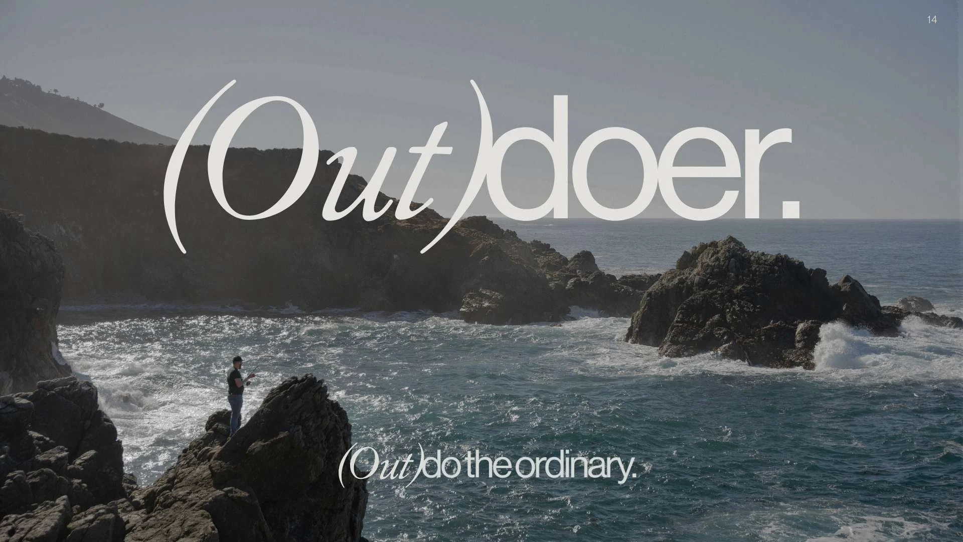
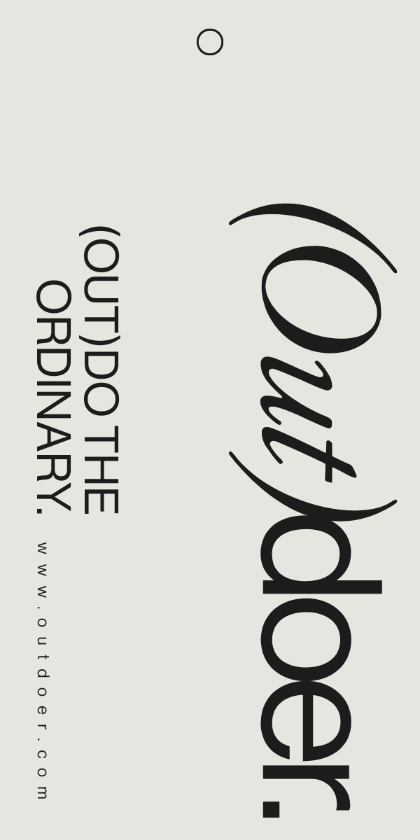
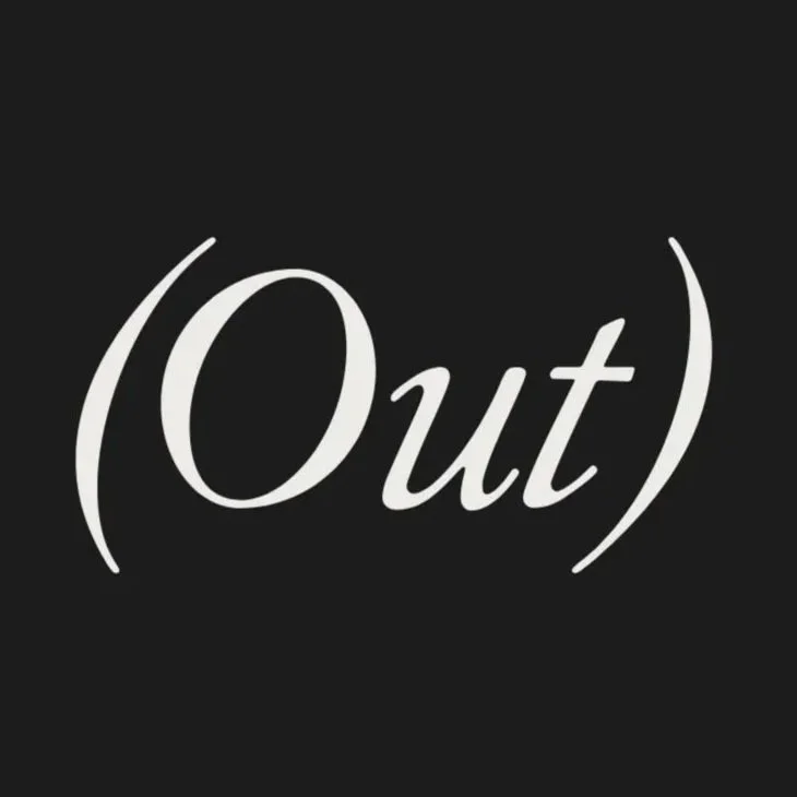
Rather than leaning on imagery alone, I looked to language itself. The parentheses became a thematic device woven directly into the typography as a way of not just communicating the brand's message, but giving it weight and context.
FINAL IDENTITYThe Logo That Landed
A deliberately unconventional typographic pairing: italic serif and clean sans serif, reflecting Outdoer's core ethos: past and present, heritage and modernity, warmth and precision. The logo is a small provocation. It asks you to look twice.
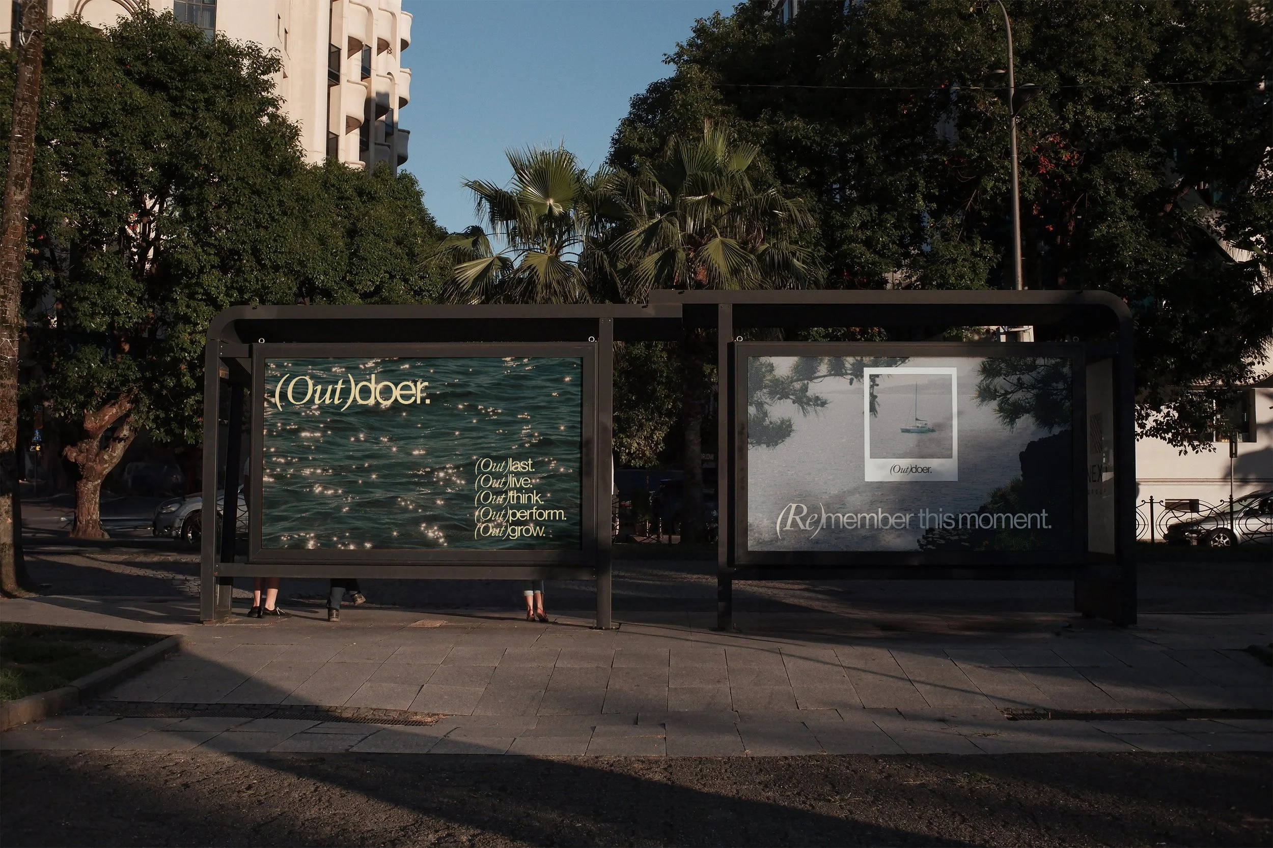
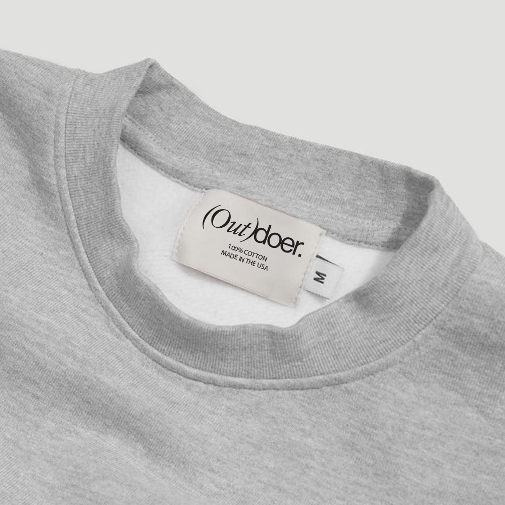
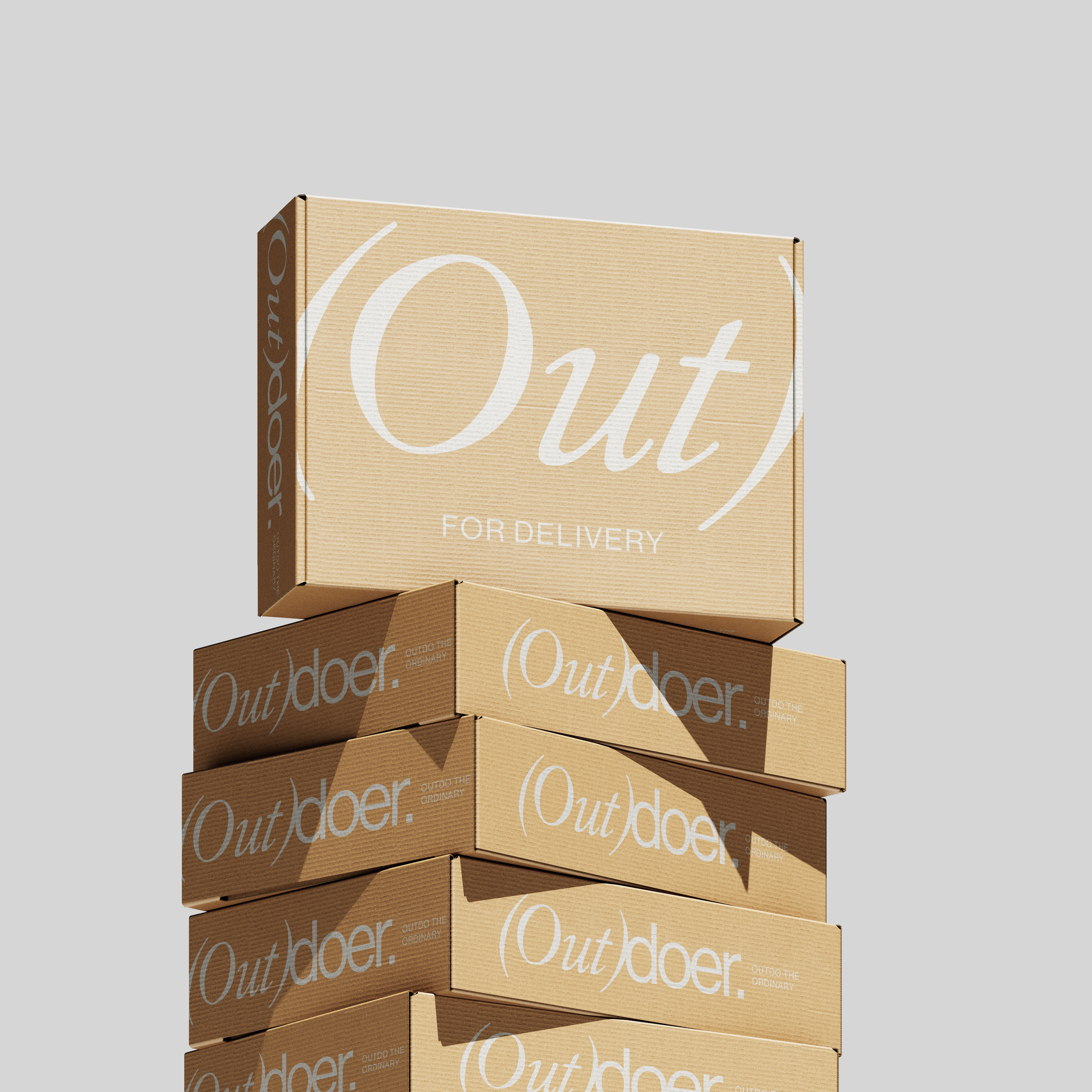
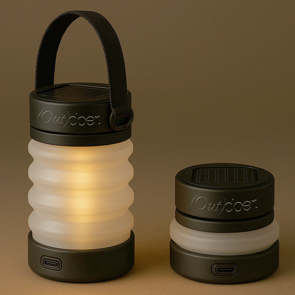
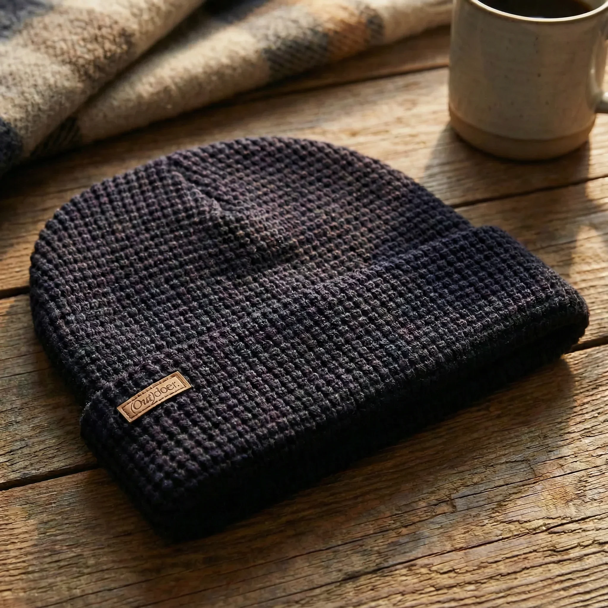
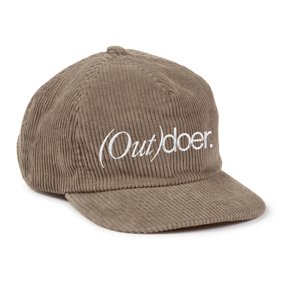
Outdo the Ordinary.
This project wasn't just a visual refresh, it was a reorientation. Outdoer came in with a brand that looked like every competitor in the category and left with one that looks like none of them. A clear point of view, a flexible identity system, and a voice that can carry a campaign. The foundation is set. What gets built on it is up to them.