Adjusted Health + Performance
ABOUT
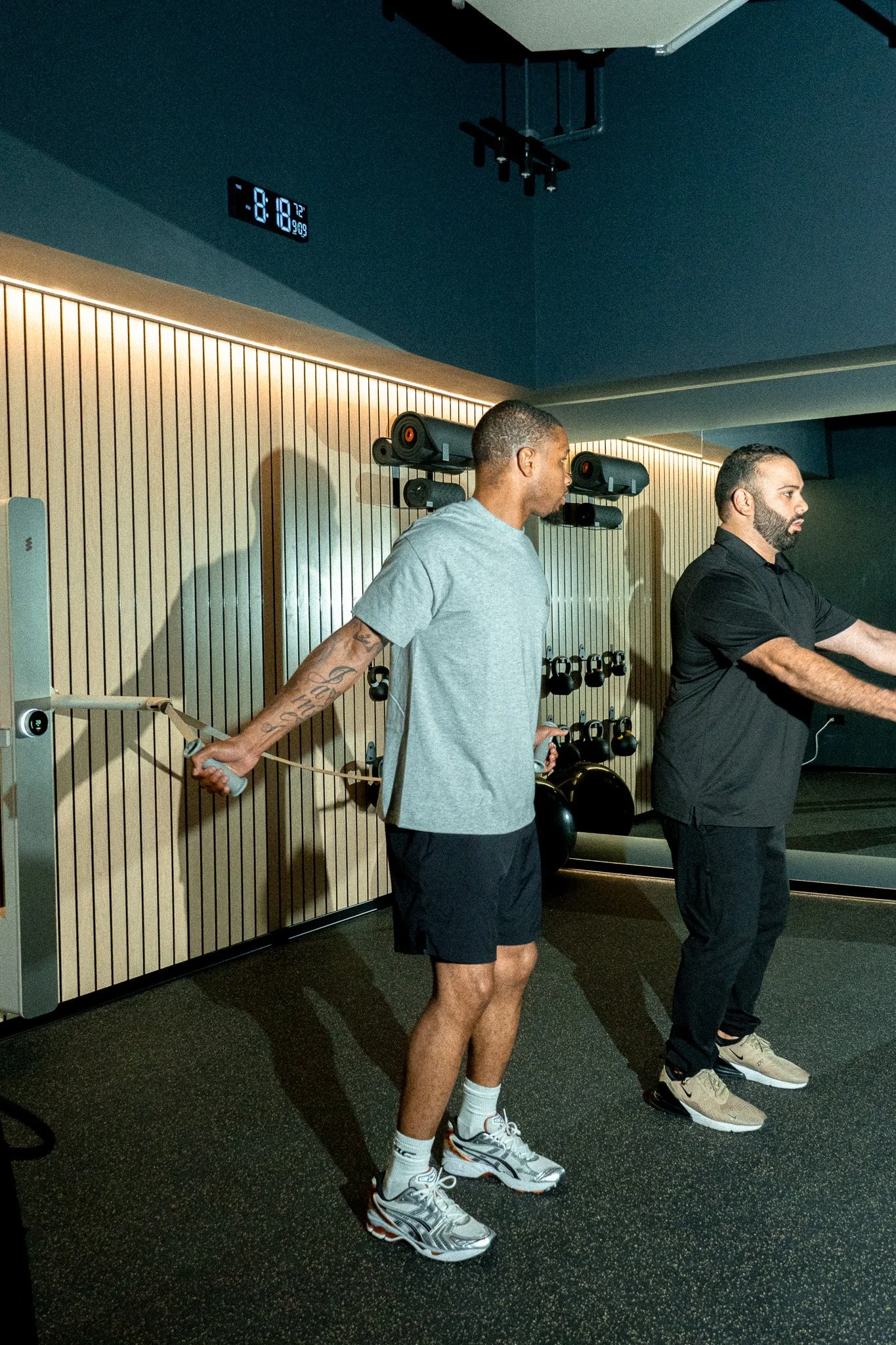
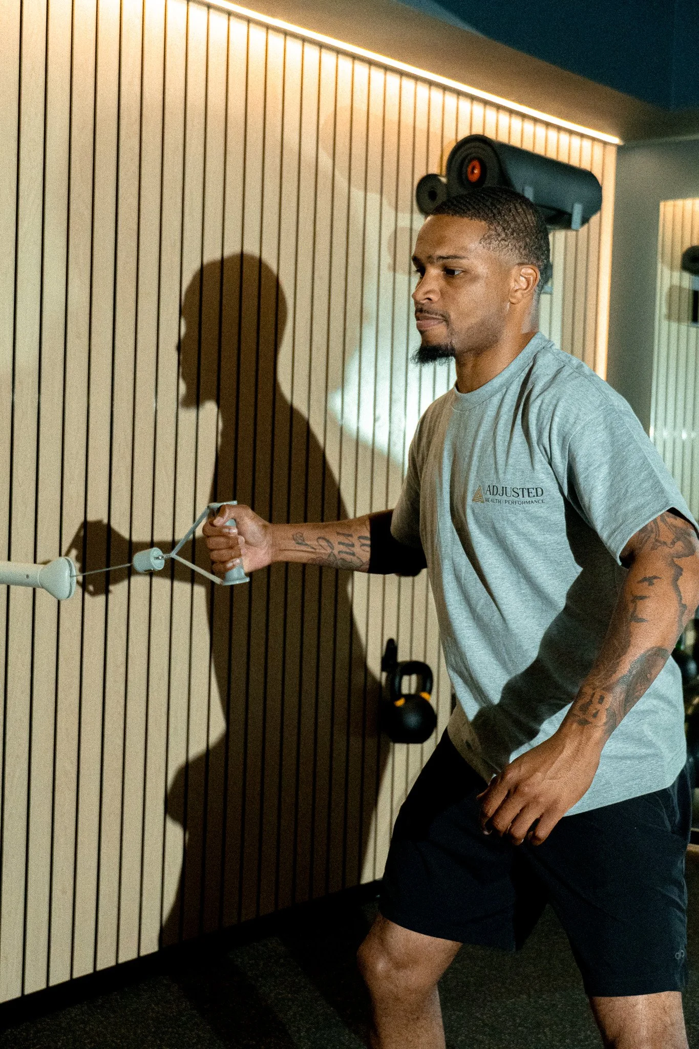
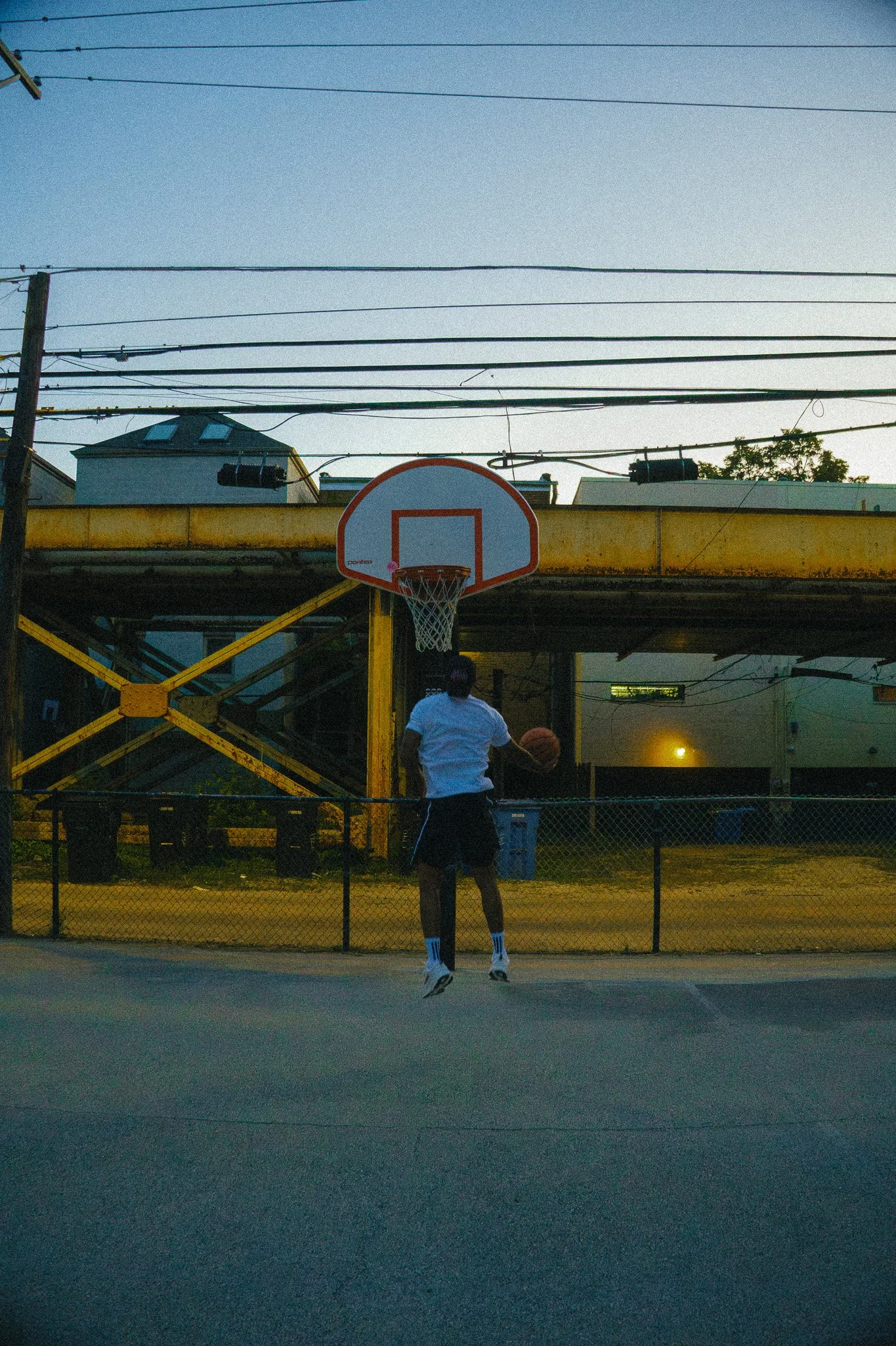
Adjusted Health + Performance isn’t your average chiropractic clinic. It’s a performance-first, precision-driven health experience. Our mission is to empower individuals of all ages to reach their highest potential through personalized care that blends chiropractic, movement, and wellness.
ROLE
Graphic Designer
GOAL
Create social media infographics, print materials, static ads, etc that all echo the brand’s mission and identity.
Logo Update 2026
V1: Original logo, created by owner of Adjusted Health + Performance.
V2: Changed by owner of Adjusted Health + Performance.
The Issue at Hand: The founder of Adjusted HP felt dissatisfied by both directions and found them both to be unbalanced, unapproachable, overly-generic, and not necessarily timeless. He didn’t find that either of these felt recognizable to the brand name itself, and didn’t stand out against competitors in a way that catered to their diverse range of clients including: young athletes seeking both preventative care and recovery care, overall wellness-centered clients, and middle aged to elderly mobility-focused clients. I was tasked with updating the full typeface and logo to better reflect the unconventional essence of this clinic in the wider scope of the medical/wellness industry while maintaining relatability, accessibility, and approachability.
A few more focus notes that the client had on this update:
Not straying too far from the originals, as the business has already been established for approximately a year and we don’t want to become fully unrecognizable.
Adding unique flare to the logo without too much embellishment: he wanted to keep it sleek, professional, and minimal but not boring.
No update to icon
The values, mission, and core tenants of the brand remained the same, so just the font update of the logo itself and typeface of any marketing/social materials were the primary focus.
Updated Logo by Alyssa Tumlos
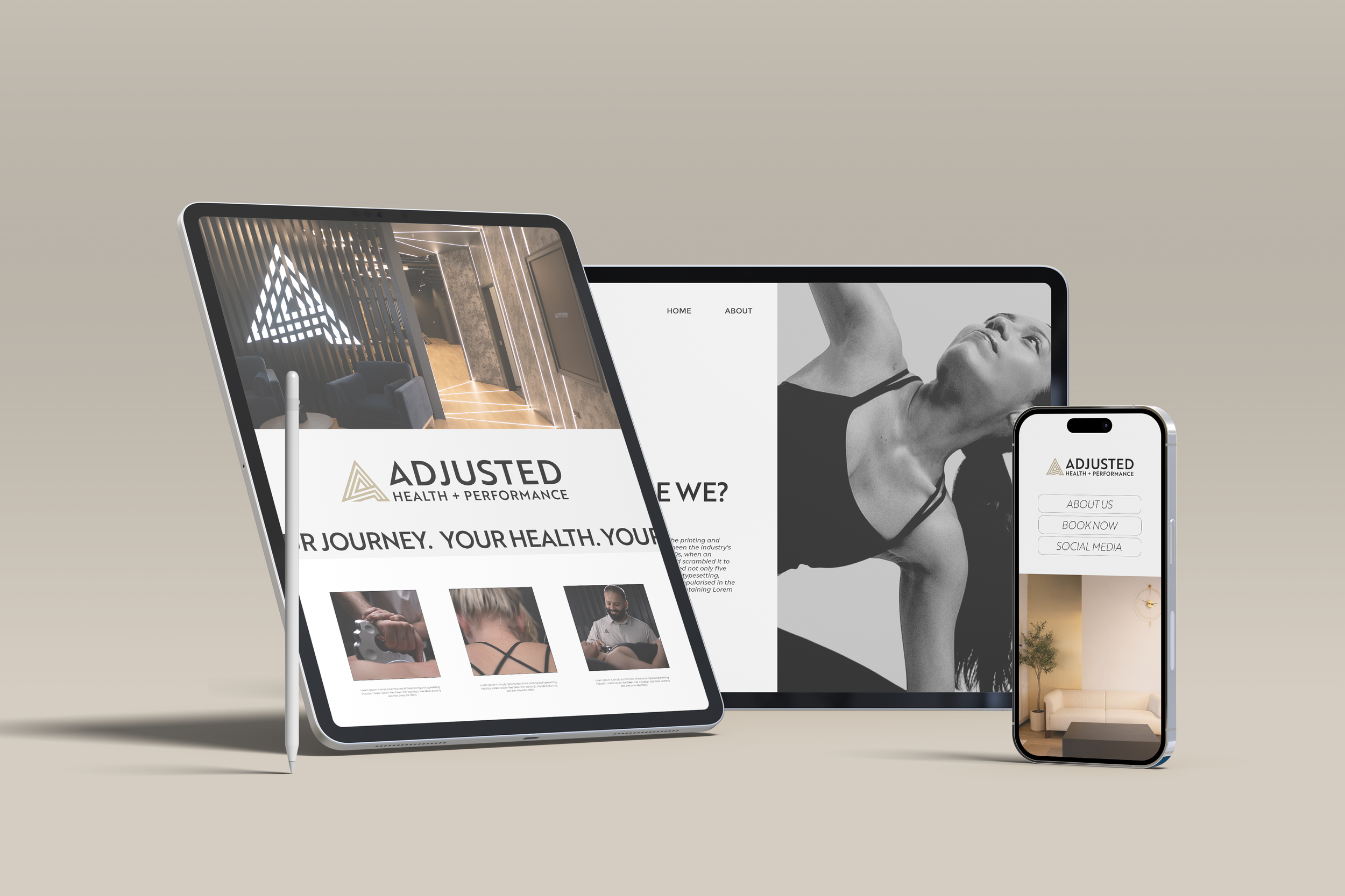

The Solution:
A sleek, professional, minimal type logo that reflects the high quality care that Adjusted HP provides. Clean lines and balanced spacing that work in unison with the unchanging icon.
Cont.
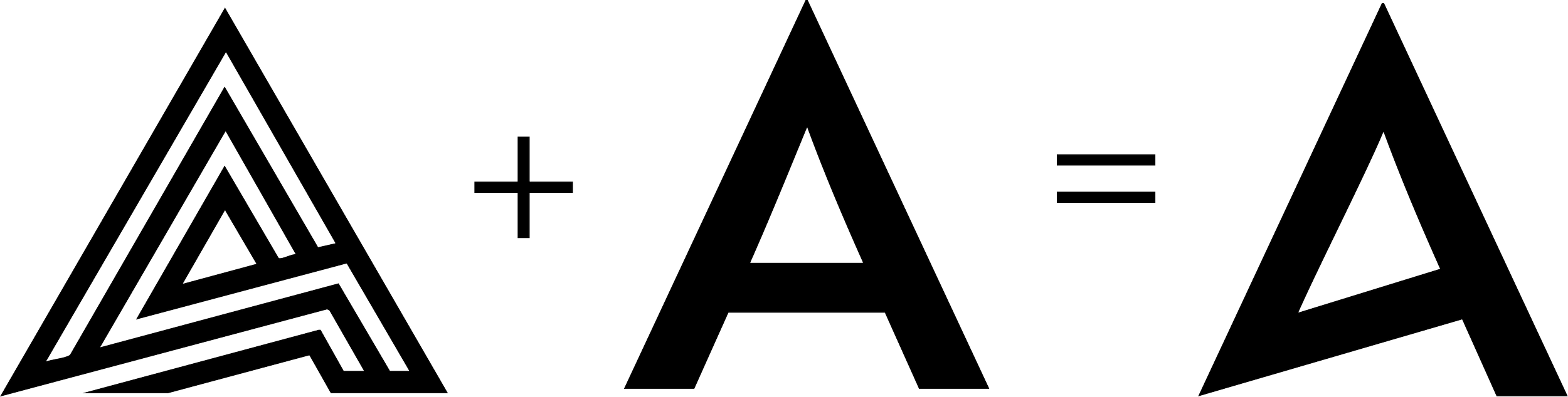
Featuring a unique, customized “A” to operate as a brand signal naturally embedded in the name itself, allowing the Adjusted name to stand alone even without the icon.
Transitioning the logo font from Roc Grotesk to Brother 1918 Medium presented the unique opportunity to utilize the relatively equilateral form of the “A” to my advantage, and experiment with angles that echo the logo icon.


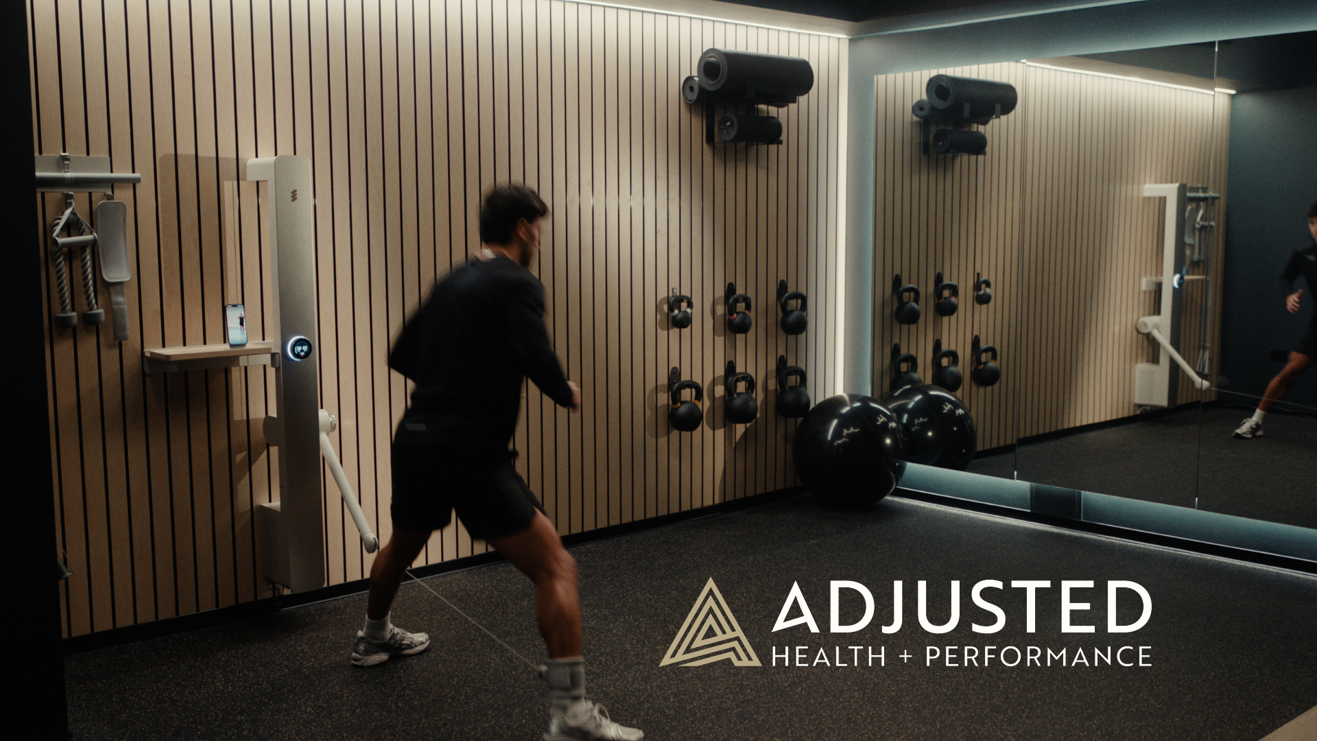
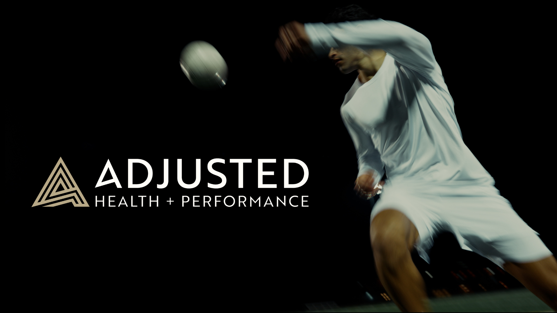
Social Media


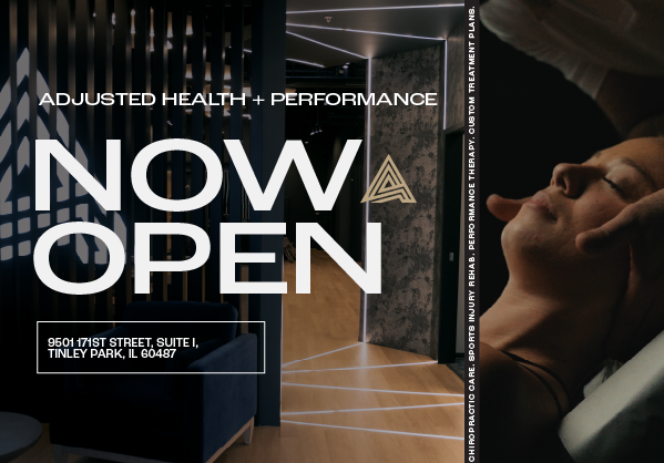


Ads


Photo Editing