Artesia Creative Agency
ABOUT
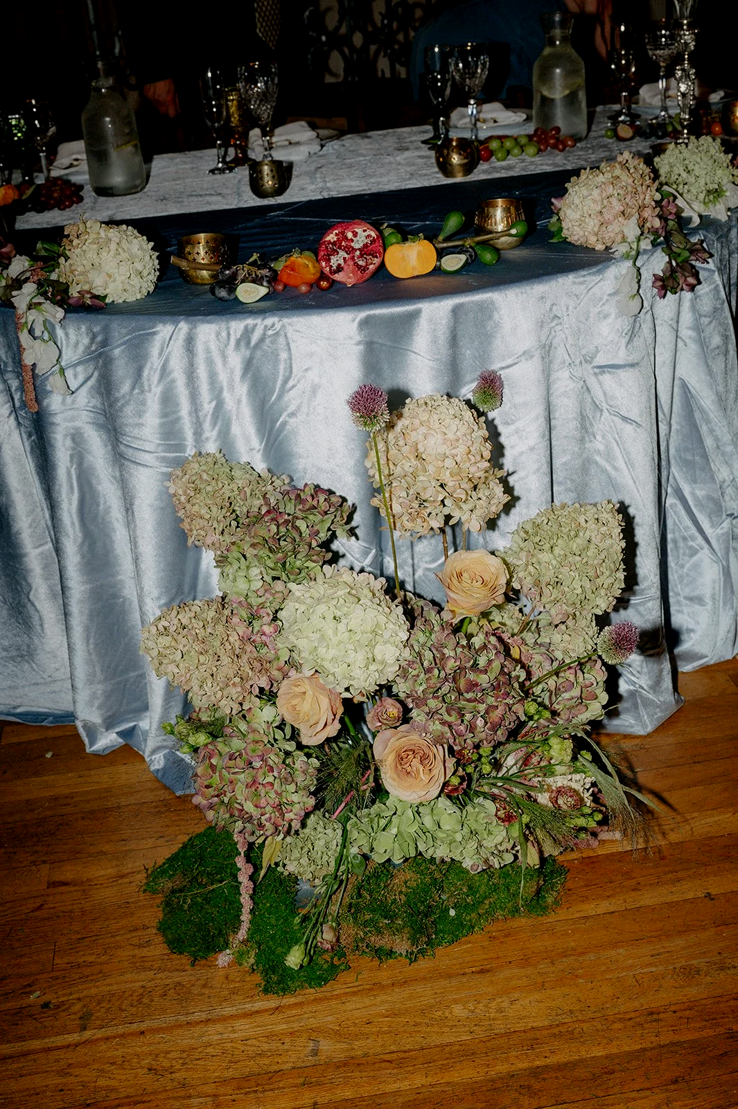
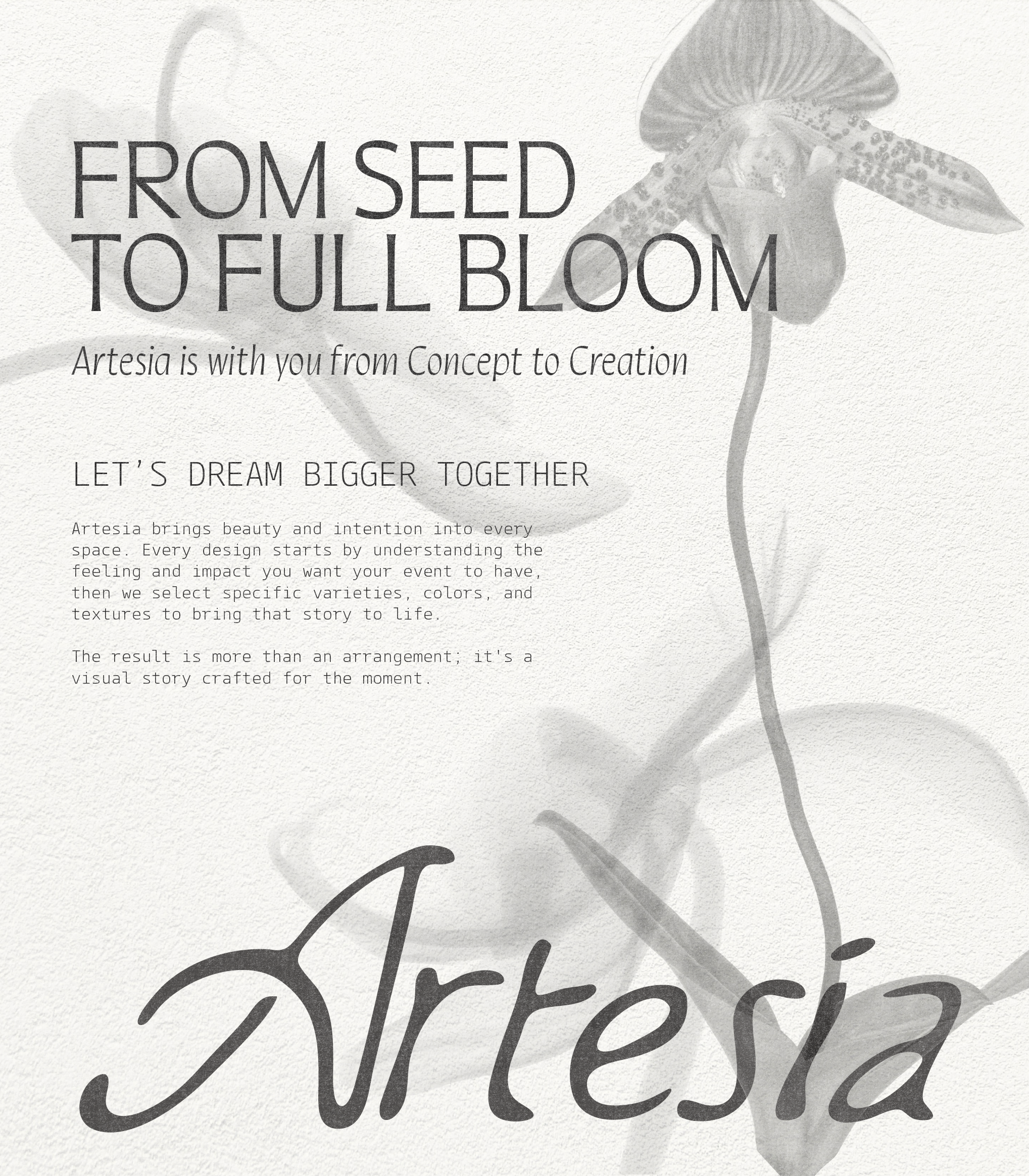
A boutique floral design studio built around intention and visual storytelling. The approach is collaborative, asking clients what feeling they want to create, then using specific varieties and colors to get there.
ROLE
Brand Designer
GOAL
Looking ahead, the goal is to move more into editorial and luxury territory and ultimately expand the creative conversation around what can be done with things that grow.
DELIVERABLES
Visual Identity
Logo/Type System
Evolving beyond the conventional
Initially established as a traditional floral brand, founder Maddie Calderaro sought to refresh the branding as her work increases in visibility, and expand her scope for clientele beyond wedding florals, and dive into contributing to brand experiences through seasonal varietal arrangements.
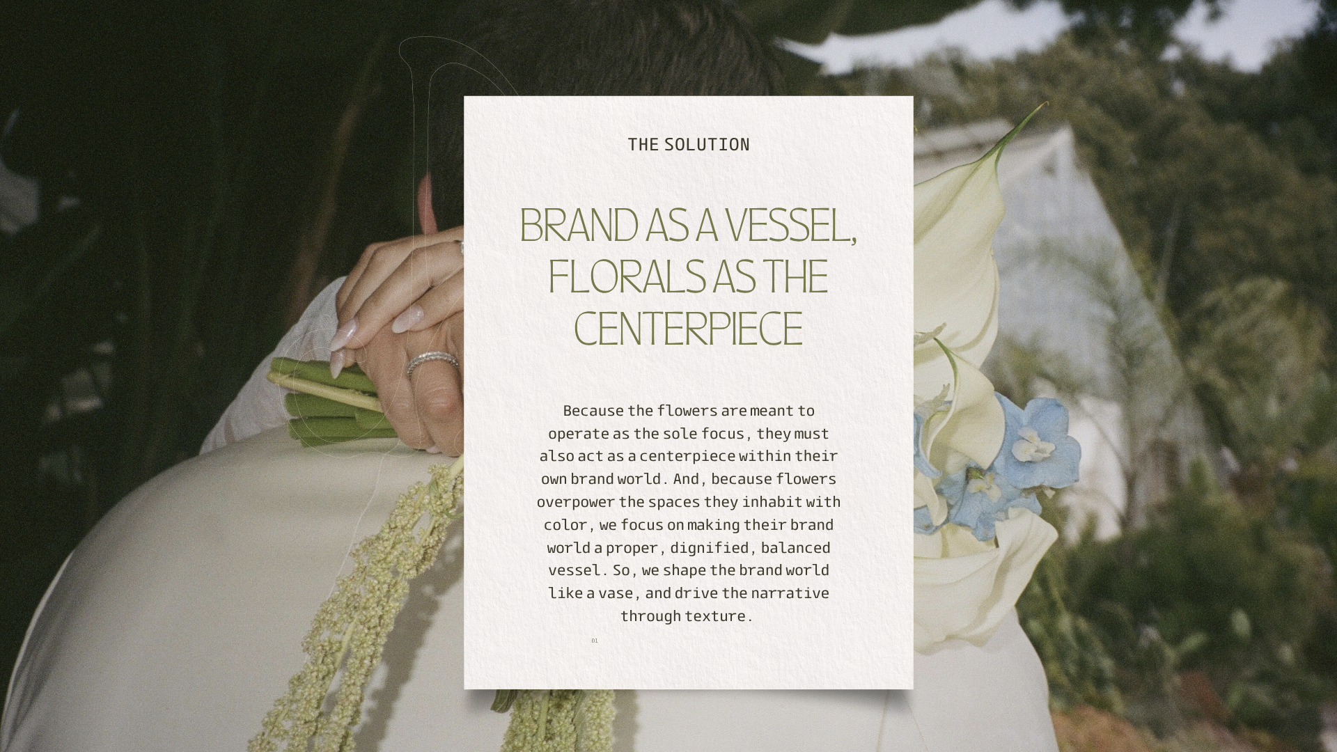
Through our collaborative effort, we landed on a brand identity that speaks to the audiences that she aspires to work with, and not limit herself to the pattern of work that she has previously done. This brand refresh honors both her original identity, while elevating her evolving identity as authentically as possible, by leaning into the hand-made, the bespoke, and the surreal.
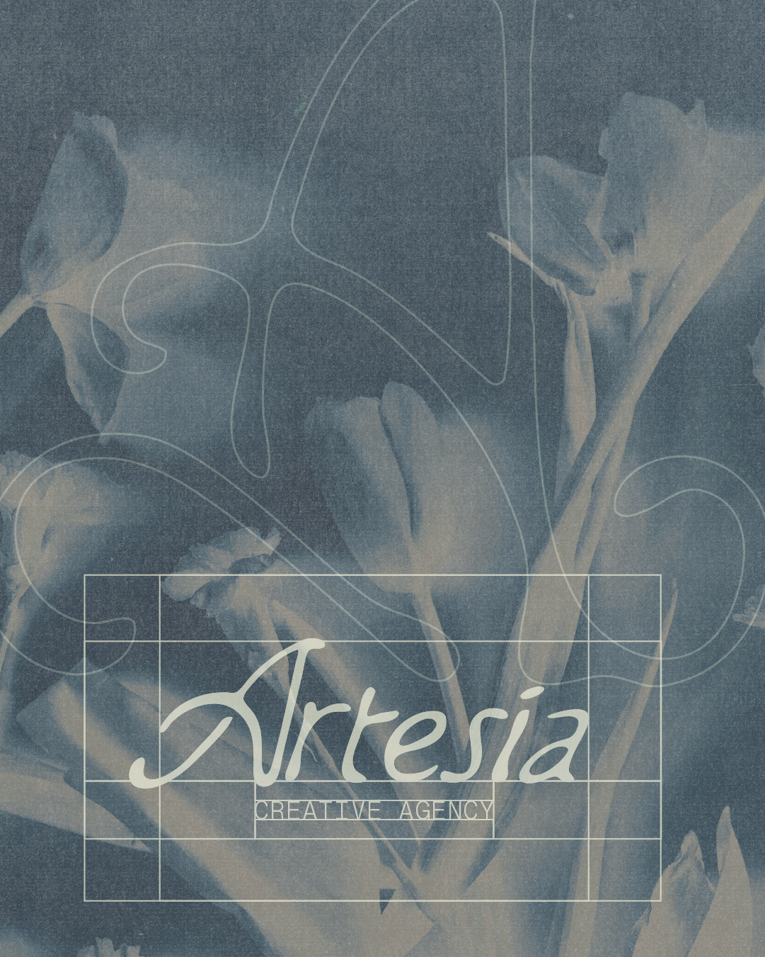
BRAND AUDITWhere We Started
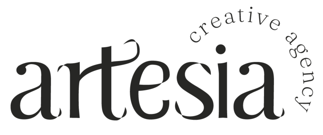
ORIGINAL LOGO
ORIGINAL COLOR PALETTE

DISCOVERYClient Questionnaire
-
“To bring beauty and intention into a space. Telling a visual story. I do this by asking clients the intended feel and impact they want their event to have and then incorporating specific varieties and colors to evoke that outcome.”
-
“Sculptural and modern, bloom-forward with more shape.”
-
“They crave a meaningful space or experience. They want to draw attention and bring life into whatever they're executing.”
-
“I think soft but dramatic curves.”
-
“I think it would push what creativity looks like with our natural resources… the possibilities of everything that grows around us are unending.”
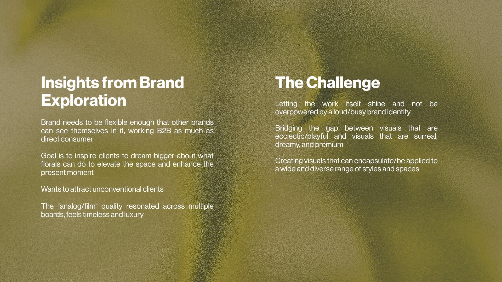
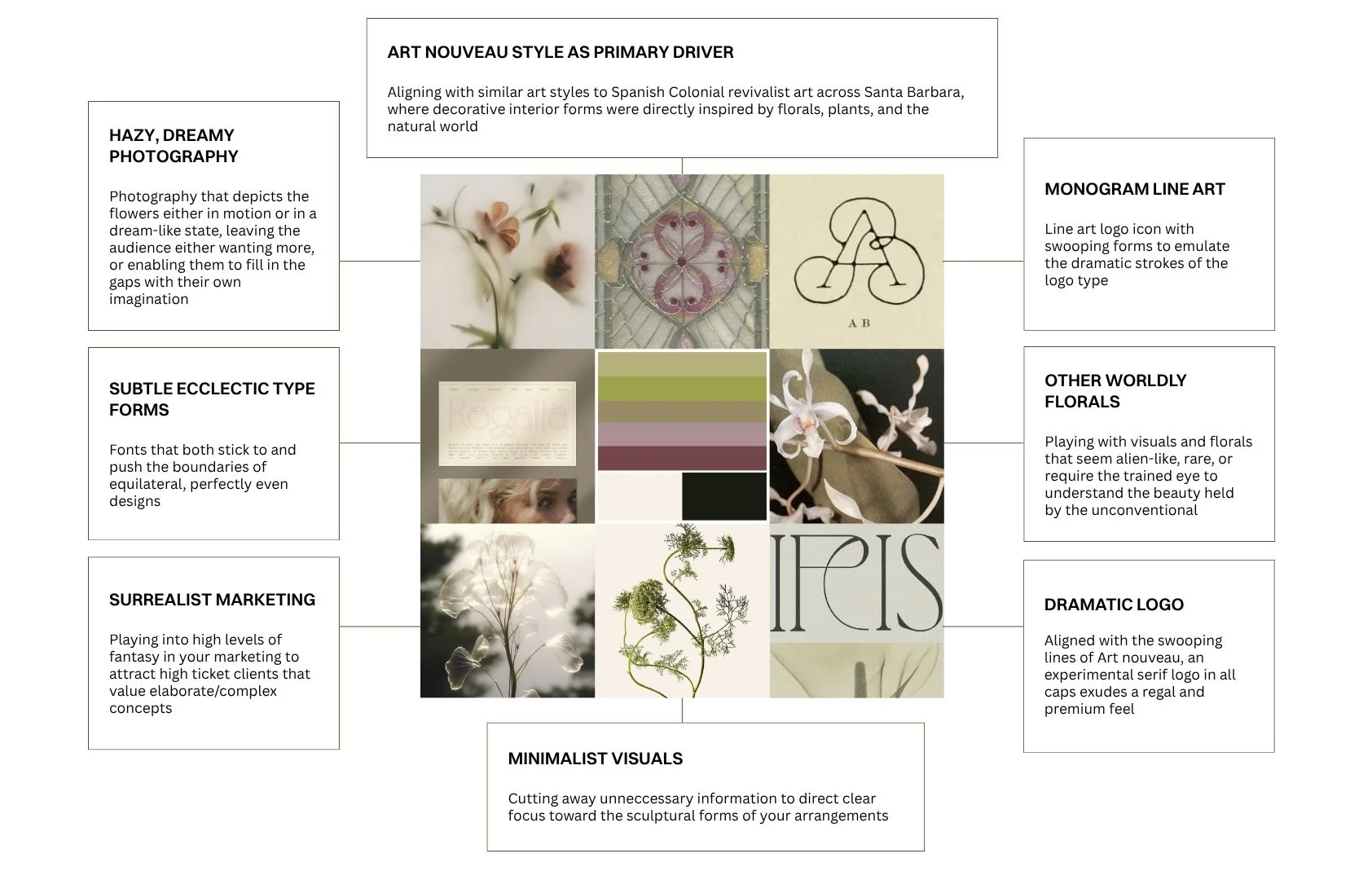
CREATIVE DIRECTIONSMood Boards Explored
01
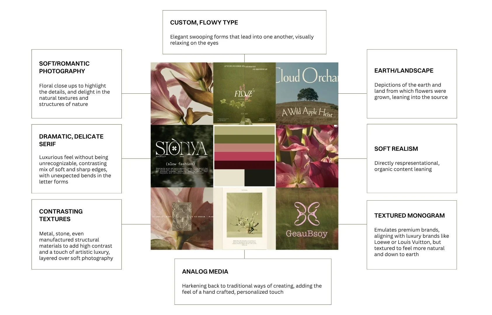
Quiet Realism
02
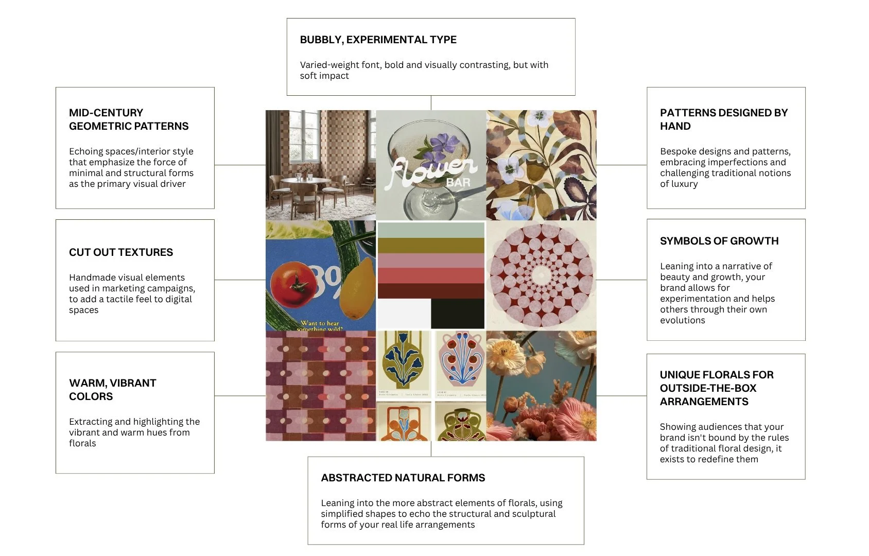
Warm Eclectic
03
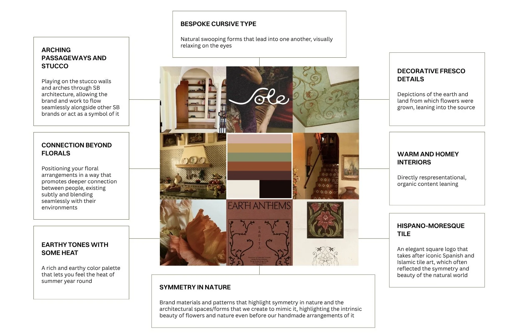
Spanish Colonial
04
Dreamy Nouveau
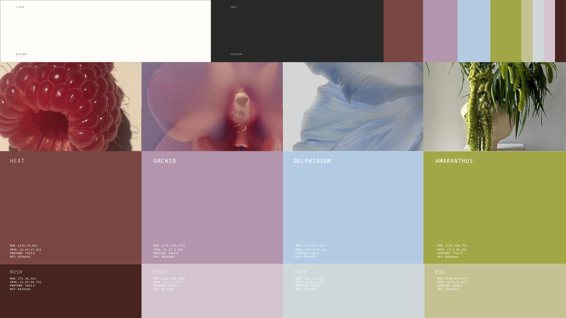
VISUAL IDENTITYRefreshed Color Palette
A palette of rich accent colors, meant to be used in tandem with the black or white core. A fusion and balance between the eclectic warm and surrealist cool. Adding a playfulness that adds a pop to the primarily neutral base.
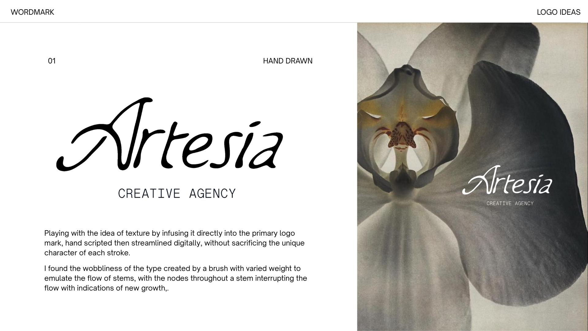
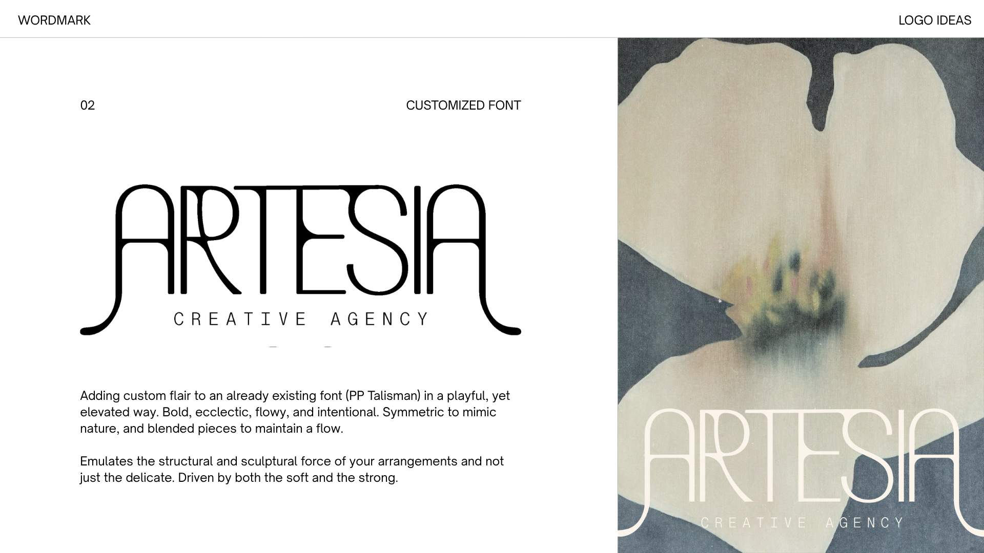
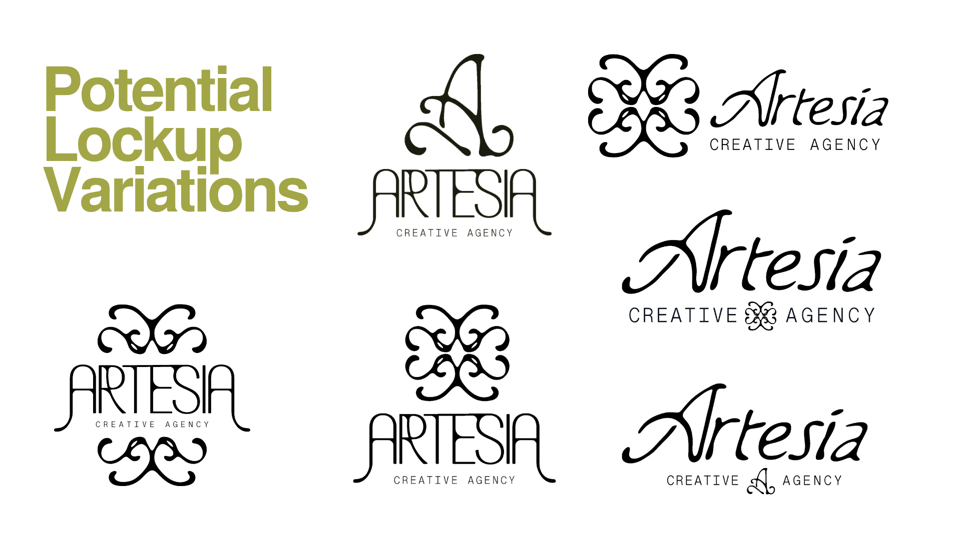
Logo Variations
VISUAL IDENTITYRefining the Visual Language
FINAL IDENTITYThe Logo That Landed
Bespoke, handwritten, imperfect, ever-flowing. Paired with a monotype secondary font in contrast with the varied weight of the header, to ground and compliment the artistic nature of brand name.
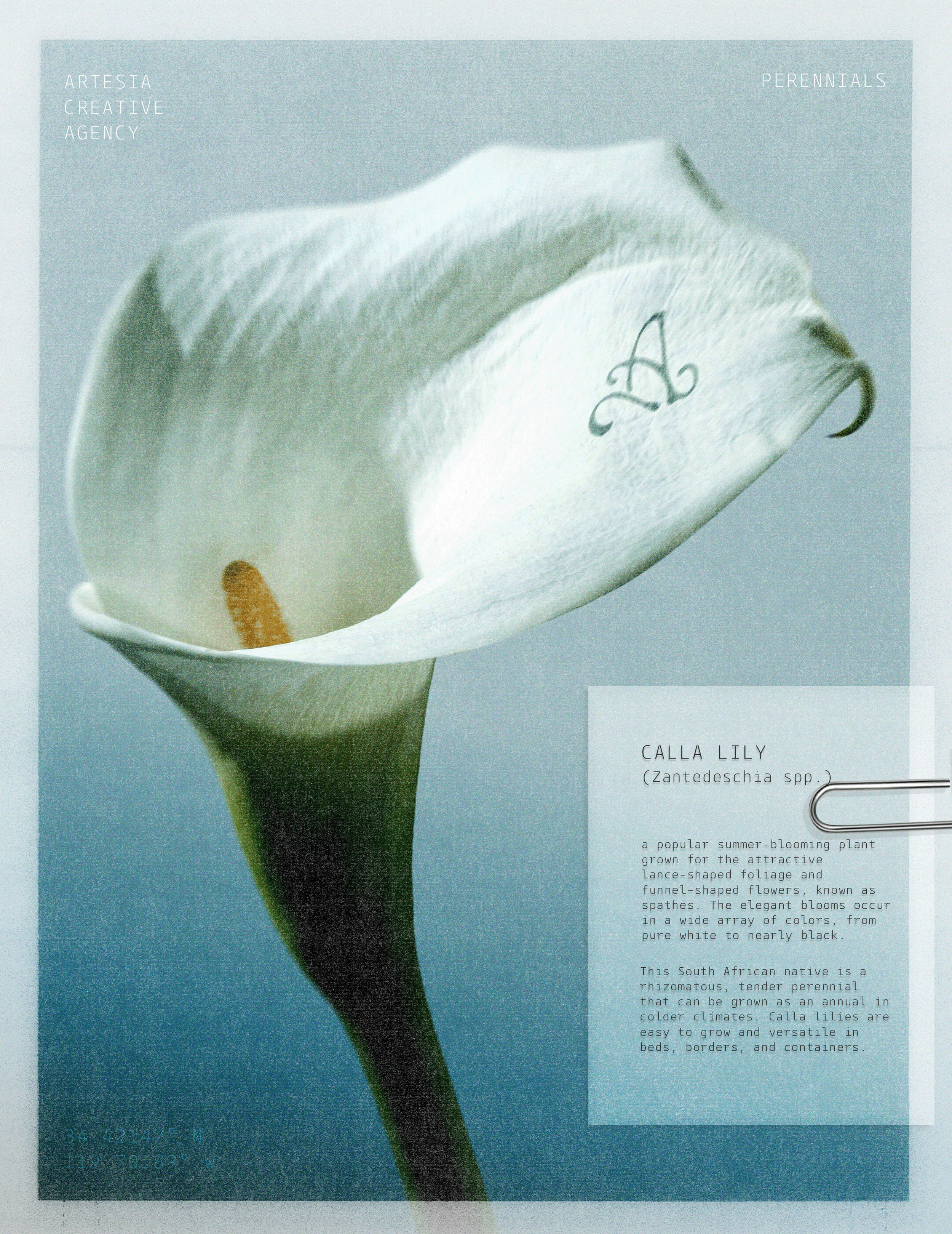
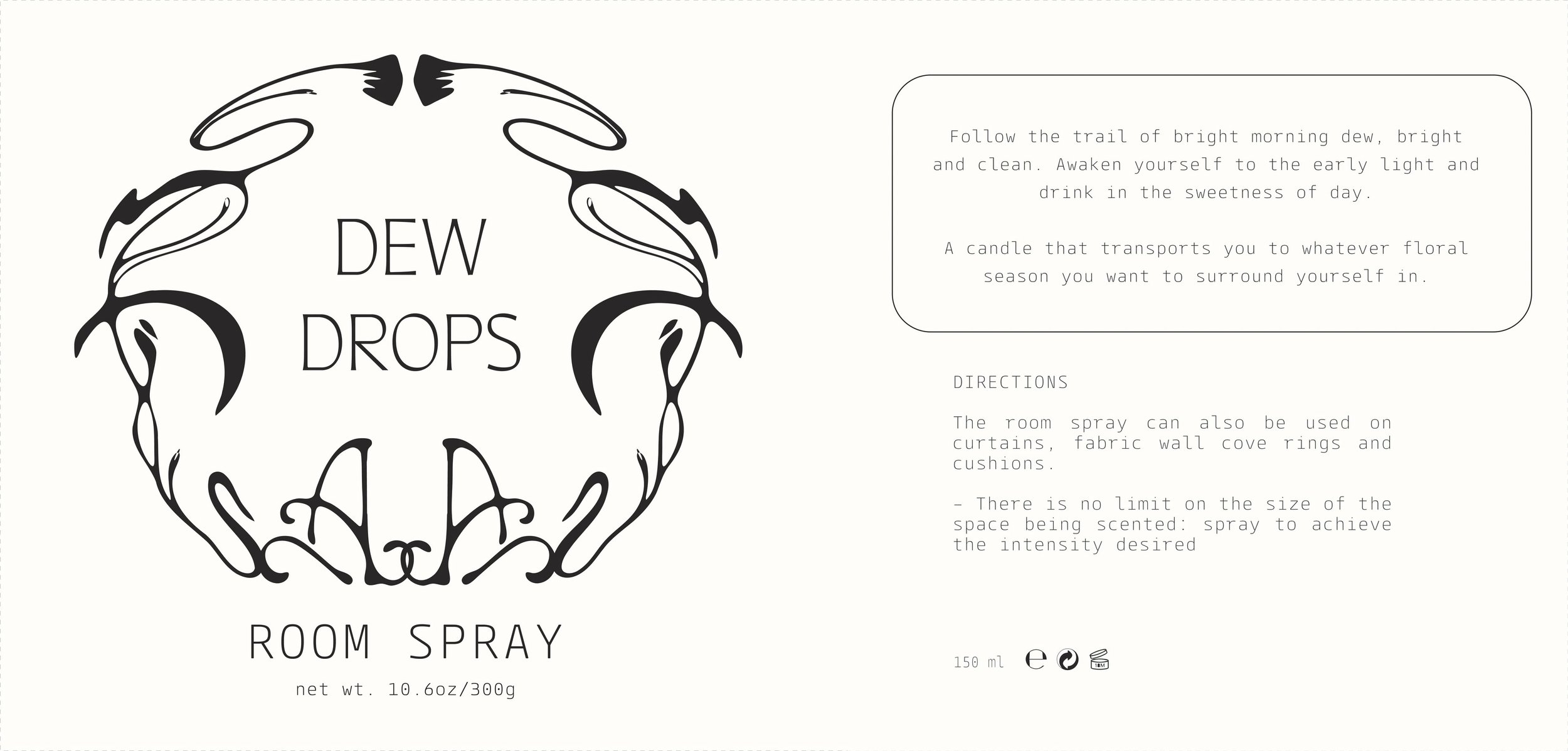
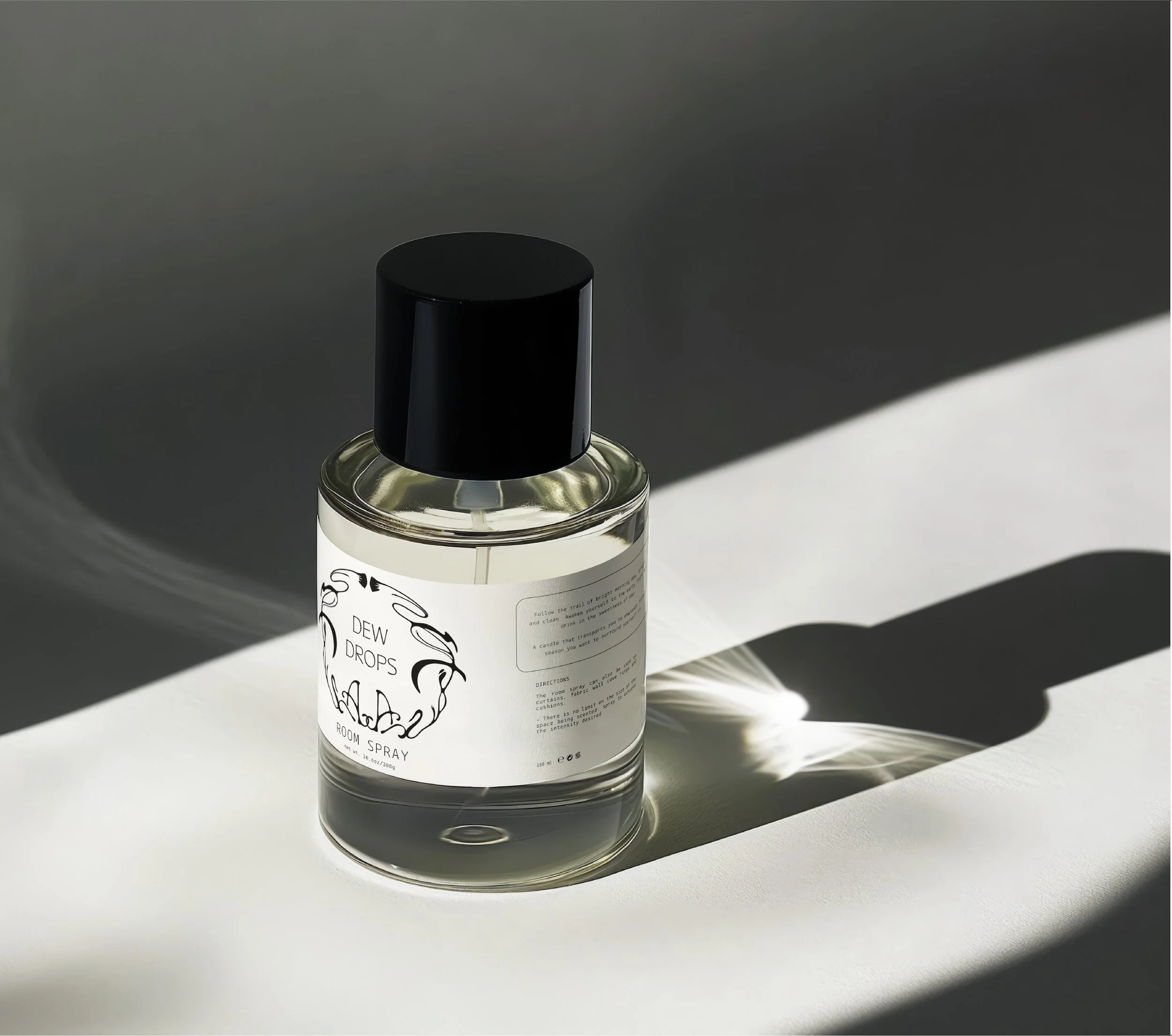
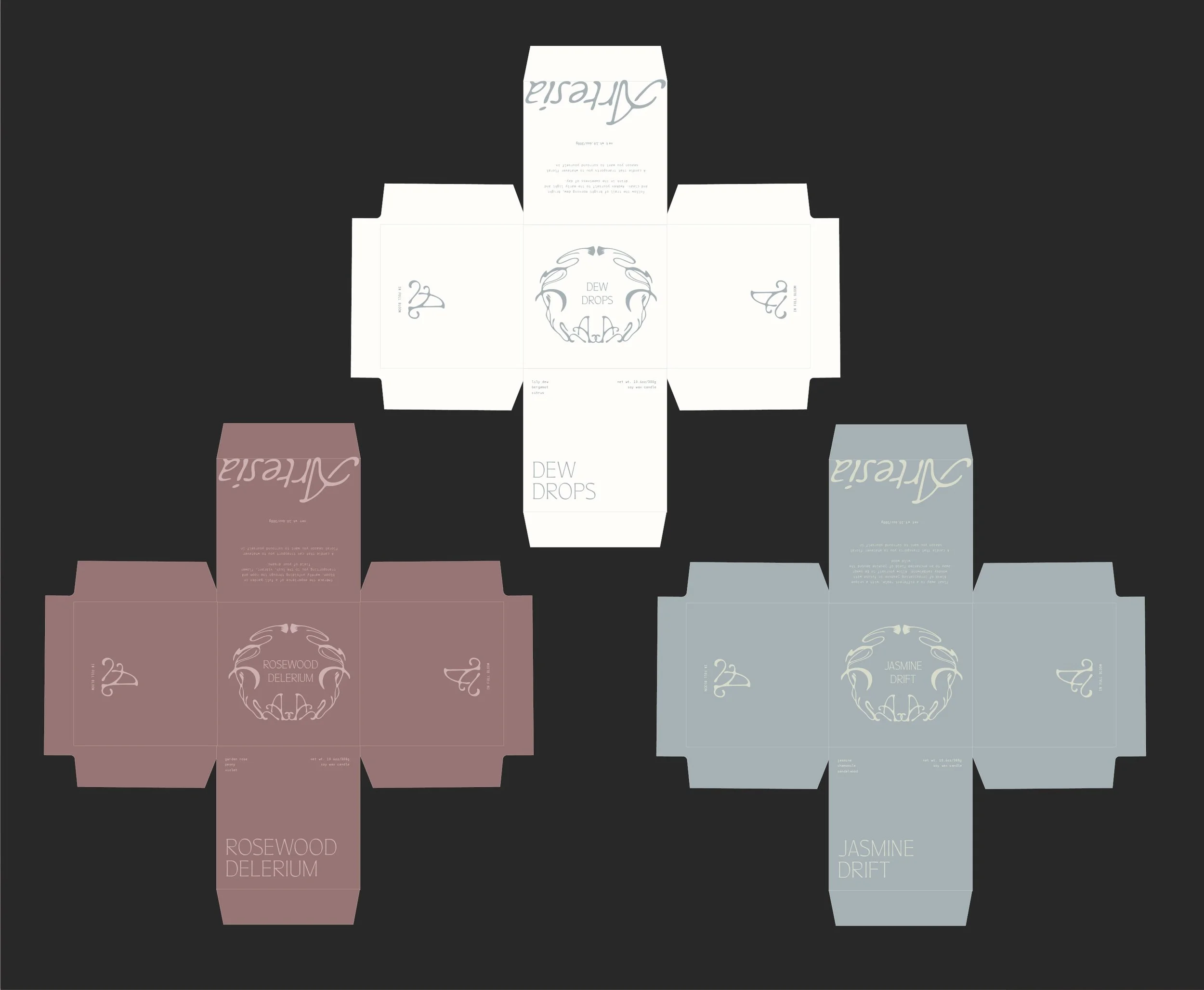
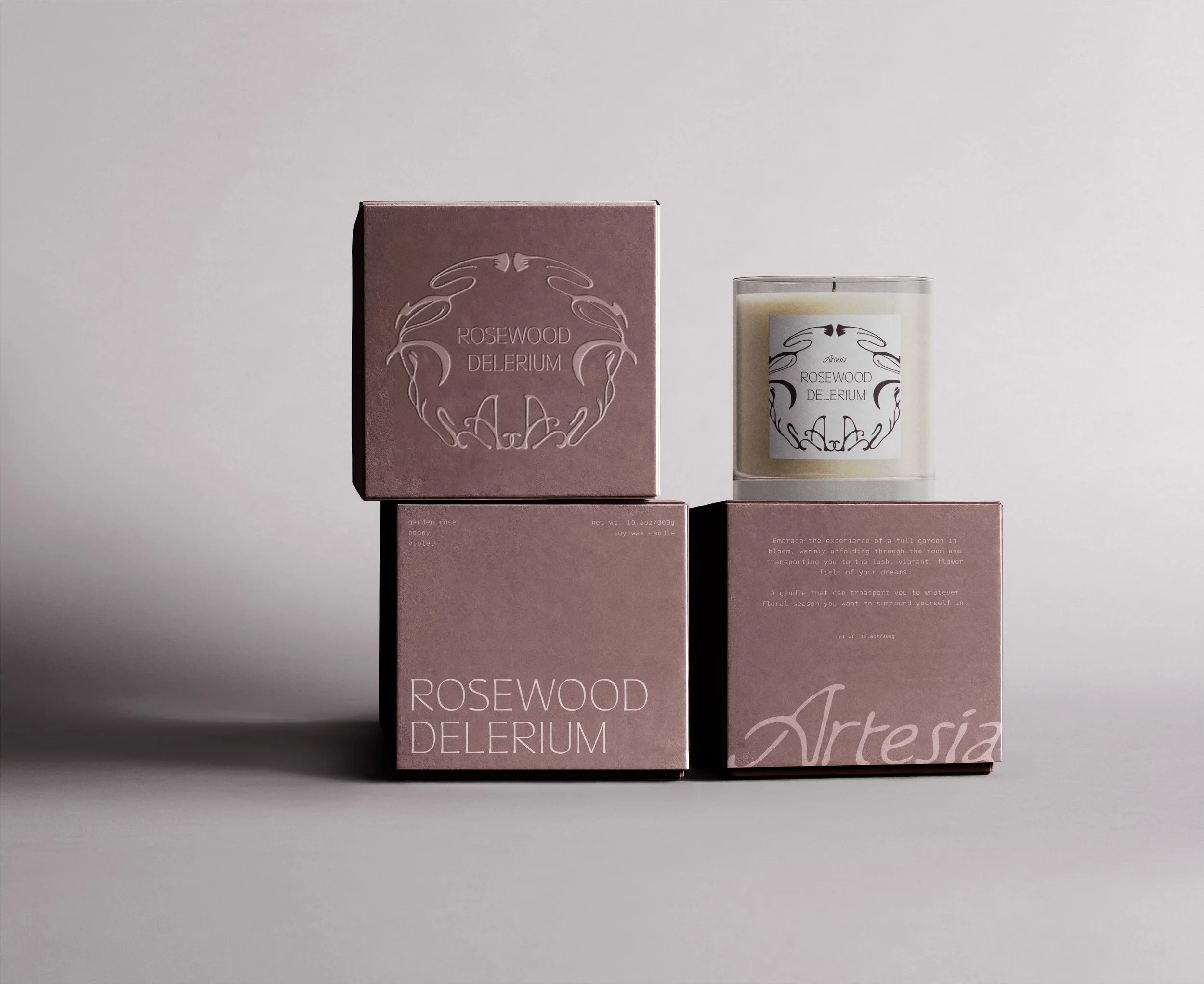
Brand Extension MockupsARTESIA FRAGRANCES
CONCEPT FOR A PRODUCT EXTENSION OF ARTESIA CREATIVE AGENCY - RESHAPING BRAND EXPERIENCES THROUGH THE SENSES
At Artesia, we have never found interest in bargaining with nature to extend the lives of florals arrangements. It’s the cycle of life, flowers grow, flowers wither, and we get to enjoy such a brief moment of time in their colors.
But, the beauty we get to experience in the light of florals doesn’t need to die with their withering. We can extend their lives in way that we do all others, through memory.
The sense that ties us closest to our memories, the sense that awakens our deepest core memories, is our sense of smell. You never forget the perfume your mother wore, nostalgic campfires under the stars, and now, you can relive the memories of your wedding day, of your most treasured brand events, through Artesia’s fragrances - custom candles and room sprays created from the floral arrangements we’ve already create together, a lasting memento that brings new life to typically discarded arrangements.